Stable diffusion prompts guide for painted holiday cards
Summary
Stable Diffusion prompts for illustrated Christmas cards require a different setup from photo-realism tutorials. Pick one painting medium for the first token, set CFG to 7, run DPM++ 2M Karras at 20-25 steps, and write a negative prompt that blocks photorealism, color banding, and cropped edges. Three tested prompts for watercolor, oil pastel, and vintage postcard styles are included.
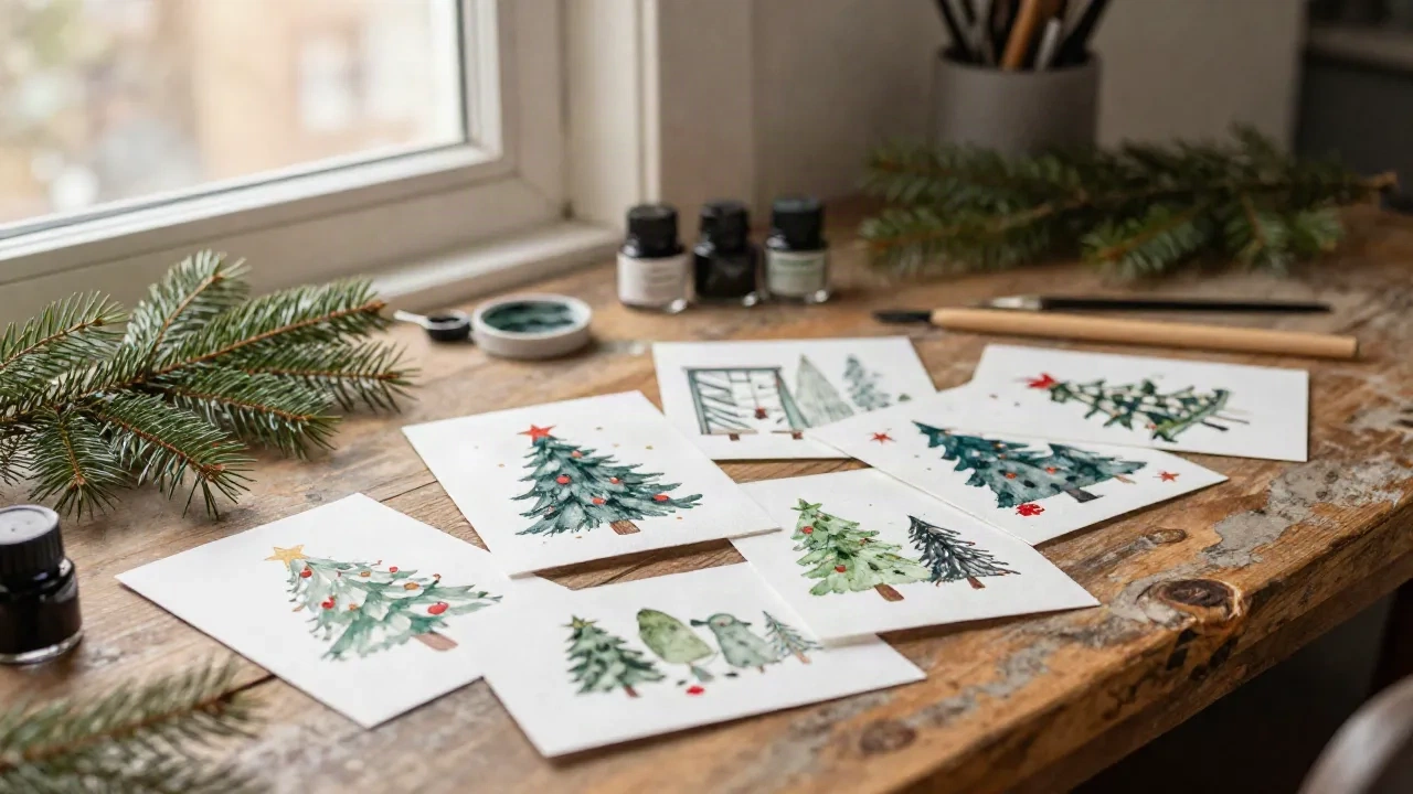
A stable diffusion prompts guide written by someone who mails 200 Christmas cards a year should start with this: most tutorials are optimized for photo-realistic outputs, and if you are trying to produce a painted card, you are working against them from word one. You need a handful of style tokens for illustration, a negative prompt that blocks what a printer cannot handle, and a CFG scale of 7, not the default. The rest is what took me two December runs to figure out.
Why illustration prompts fail when you copy settings from photo tutorials
The first time I tried to get Stable Diffusion to produce something that looked like a painted card, I used the settings I had seen in a YouTube tutorial for photo-realistic portraits. CFG scale at 12, DPM++ 2M Karras at 40 steps, and a prompt that started with "photorealistic, 8K, ultra-detailed." What I got was a Christmas scene that looked like a stock photo someone had smeared with a watercolor filter in the last five seconds.
The issue is structural. Photo prompts are optimized to suppress artistic interpretation. The model is being told to stay close to what a camera would see, so all the tokens pushing toward illustration, loose brushwork, and painted warmth are fighting against the quality modifiers. You cannot add "watercolor Christmas card" to a photorealism-biased prompt and expect the model to know which one wins.
The other problem is resolution expectations. Cards that go to a printer need at least 300 DPI at the physical card size, typically 148 x 105mm or 5 x 7 inches. A 512x512 output from an SD 1.5 base model will not survive being enlarged to that. SDXL outputs at 1024x1024 by default, which gives you something to work with, but you still want to prompt for quality at the generation stage, not hope you can upscale your way to it afterward.
Here is what actually changes the output: remove the photorealism tokens first, then rebuild the prompt around the medium you want. A watercolor Christmas card is a completely different prompt architecture from a realistic Christmas photo, and treating it as such from the start cuts the iteration time roughly in half.
The five style tokens that change a flat output into something worth printing
Not all style tokens carry equal weight. From the batches I have run for Foxglove & Post, these five consistently shift the output toward something I can send to the printer without embarrassment.
"gouache illustration" or "watercolor painting" -- not both at once. Mixing painting media in a single prompt usually produces mud. Pick one and hold it.
"vintage greeting card aesthetic" -- this single phrase pulls the model toward mid-century illustration conventions: flatter color, cleaner outlines, less photographic noise. It also tends to soften the digital perfection that makes AI images look immediately like AI images.
"loose brushwork, soft edges" -- without this, watercolor prompts often generate something that looks more like a digital watercolor preset than actual watercolor. The specificity of the brush behavior helps.
"warm color temperature, limited palette" -- a Christmas card with 40 saturated colors fighting each other does not print well. Instructing the model to constrain the palette early produces more coherent results at print.
"no text, no watermark" -- yes, in the positive prompt as well as the negative. Having it twice is not redundant. SD models have seen enough images with overlaid text that the instruction needs reinforcing if you want a clean working area.
On token order: front-load the most important tokens. For illustration work, that means medium first, subject second, style references third. Something like "watercolor painting, vintage greeting card aesthetic, [your subject], loose brushwork, soft edges, warm color temperature, limited palette, no text, no watermark." Quality tags like "highly detailed" go after the style tokens, not before.
What to put in your negative prompt when the card goes to a printer
The negative prompt is where you reclaim control over what SD will default to if you are not specific. For card printing, the stakes are slightly different from personal use: an artifact that looks minor on screen can become a visible flaw at 300gsm, 5x7 inches.
For illustrated Christmas card work, this is the negative prompt I currently use as a starting point:
lowres, bad anatomy, bad hands, text, error, watermark, signature, username, blurry, pixelated, photorealistic, 3d render, CGI, extra fingers, cropped edges, overexposed, color banding, jpeg artifacts, stock photo
A few of these need unpacking. "Photorealistic" and "3d render" in the negative prompt tells the model to avoid the rendering modes that undercut the illustration aesthetic. If you are aiming for watercolor, you do not want the model to drift toward a hybrid that is half-painted, half-photographic.
"Color banding" is worth adding if you are going to print. Digital banding in gradients is not always visible on a monitor but tends to show up in offset printing. Flagging it at the prompt level reduces how often you see it.
"Cropped edges" matters for card layout. SD crops aggressively by default when the subject feels too large for the frame. A card with half a pine tree visible on the right edge is not useful to a printer.
CFG scale interacts with your negative prompt in a way worth understanding. At CFG 12, the model amplifies both positive and negative instructions, which can cause over-correction: you ask it to avoid text, and it starts warping anything that might conceivably look like letters. CFG 7 gives the negative prompt weight without this artifact risk.
CFG scale and sampler: the two settings most guides get wrong for art styles
Most SD tutorials recommend starting at CFG 7 and adjusting from there. For photorealistic work that is reasonable. For illustration, it is almost always the right place to stay.
CFG scale controls how strictly the model adheres to your prompt versus exercising its own interpretation. High values (10-14) force adherence so rigidly that the model artifacts out: oversaturation, waxy textures, color explosions in the corners. For watercolor work specifically, CFG 10 or above tends to produce saturated blobs rather than delicate washes. The recommendation based on community consensus and my own testing: stay at CFG 7 for watercolor and oil pastel work, and move to CFG 8-9 only if the output is drifting too far from your subject.
For sampler, DPM++ 2M Karras at 20-25 steps is the reliable baseline. It produces consistent illustrated outputs and is the community standard for good reason. Euler a at 30 steps works well for slightly looser results; DDIM tends to be slower without adding quality for this type of output. If you are running SD 1.5 rather than SDXL, drop to 512x512 with these settings and plan to upscale with a model like Remacri, which preserves illustration character better than Real-ESRGAN for painted work.
Steps beyond 30 rarely improve illustration quality and add processing time. For card prototyping runs, 20 steps at CFG 7 is fast enough to iterate through a dozen versions in an afternoon.
How to write a prompt around a reference style you have in your head
The most common prompting frustration I hear from card makers is this: "I know exactly what I want it to look like, and I cannot make the model understand." This is usually a vocabulary problem, not a capability problem.
SD has learned from a large corpus of labeled images, which means it responds better to named styles and named artists than to descriptions of how the style feels. "Warm and painterly" is vague. "Oil pastel illustration, mid-century American holiday card, Norman Rockwell palette" is specific enough for the model to triangulate.
A useful approach when you have a style in your head: work backwards from its historical references. Most holiday card aesthetics map to one of these clusters.
1940s-1960s American Christmas cards -- the mass-market illustration work from the Hallmark golden era. The visual signatures: flat-ish fields of color, a slightly chalky finish, compositions built on silhouette and light source. Useful tokens: "mid-century American Christmas illustration, gouache, flat color fields, warm amber and deep indigo palette."
Victorian and Edwardian English cards -- the tradition of the Kate Greenaway era and the 1880s Louis Prang printing innovations. Dense detail, botanical motifs, robin redbreasts on snowy branches, deep saturated greens and reds. Tokens: "Victorian Christmas card style, detailed botanical illustration, deep jewel tones, Kate Greenaway influence."
1970s and 1980s Scandinavian Christmas -- clean lines, limited palette (often cream, burnt red, dark navy), a geometric quality in the trees and figures. Tokens: "Scandinavian Christmas illustration, linework, limited three-color palette, cream and deep red, geometric pine trees."
The cleaner your style reference, the less work you leave the model to do, and the less correction you need afterward. When I am prototyping a new card design, I build the style reference tokens first, test a few outputs, then layer in the specific subject details.
Three tested prompts for watercolor, oil pastel, and vintage postcard styles
These are the three prompts I ran last December for Foxglove & Post's card range. They are not templates -- copy them and your output will look different from mine because models vary -- but they function as working starting points.
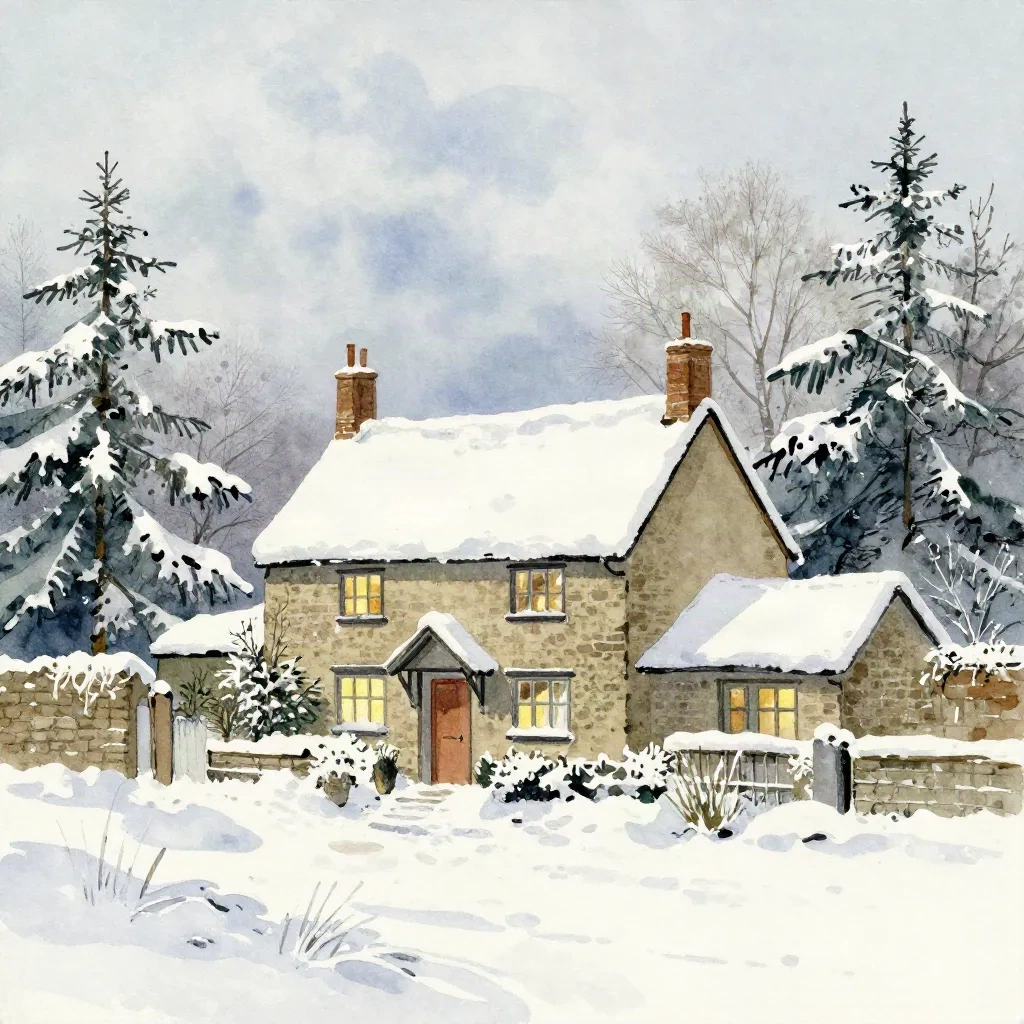
Watercolor cottage scene
Prompt: watercolor painting, vintage greeting card aesthetic, snow-covered English cottage with warm glowing windows, pine trees, soft wet-on-wet brushwork, pale blue-grey winter sky, loose delicate washes, limited warm palette, highly detailed illustration, no text, no watermark
Negative: lowres, text, watermark, photorealistic, 3d render, color banding, cropped edges, bad anatomy, blurry
Settings: CFG 7, DPM++ 2M Karras, 22 steps, 1024x1024
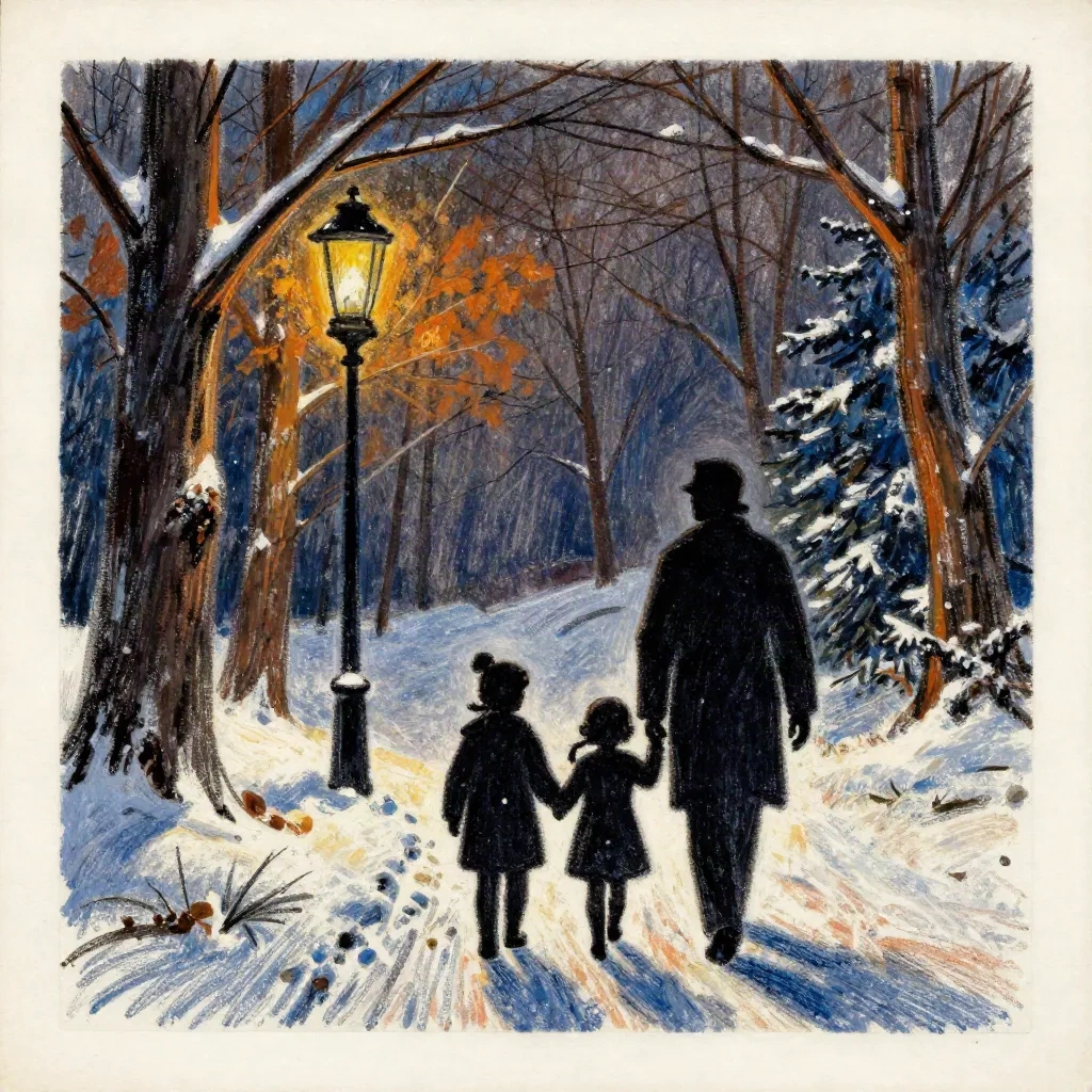
Oil pastel family silhouette
Prompt: oil pastel illustration, mid-century American Christmas card, family silhouette walking through snowy woodland with lantern, warm amber and deep blue palette, rich textured pastels, flat color fields, hand-rendered quality, highly detailed, no text, no watermark
Negative: photorealistic, 3d render, CGI, text, watermark, stock photo, color banding
Settings: CFG 8, DPM++ 2M Karras, 25 steps, 1024x1024
Vintage postcard robin
Prompt: vintage Christmas postcard illustration, robin redbreast on snow-covered holly branch, Victorian greeting card style, deep jewel tones, detailed botanical, cream background, red berries, ink-and-watercolor hybrid, no text, no watermark
Negative: photorealistic, 3d render, text, watermark, blurry, cropped
Settings: CFG 7, Euler a, 28 steps, 1024x1024
Run each at three different seeds before committing to a direction. What you see in the first output is not always representative -- the third seed often produces something the first one could not find.
What the file needs before it survives the fold
Getting a good illustration out of SD is the first half. The second half is making it print-ready, and this is where people most often lose a good image.
The minimum working resolution for a 5x7 inch card at 300 DPI is 1500x2100 pixels. An SDXL output at 1024x1024 is too small for a 5x7, so you need to upscale before sending to a printer. For painted work, Remacri or 4x-UltraSharp preserve edge softness better than Real-ESRGAN 4x Plus, which sharpens everything and can make a loose watercolor look crisp in the wrong direction.
The fold itself is where problems appear. SD outputs tend to concentrate the most important detail at center. If the card folds along the vertical center, which most 5x7s do, check that neither half of the composition is cut off by the fold. The ground plane, the horizon, and any central figure should sit in one half or the other, not straddling the crease.
Color profile: printers generally want CMYK or at minimum an sRGB file. SD outputs are in sRGB. The conversion to CMYK shifts blues and certain reds; navy tends to go slightly purple and pure red can dull. Convert before sending and check the proof on screen rather than the original sRGB file.
You will notice the difference at 300gsm. That is when the illustration either holds its character or collapses into something that needed one more iteration.