Midjourney Prompts Guide for Christmas Card Design
Summary
This guide covers how to write Midjourney prompts for print-ready Christmas card illustration. It walks through prompt structure, the watercolor and mid-century styles that work best at card scale, why text handling still requires a post-production step, and what resolution you need before sending anything to a printer.
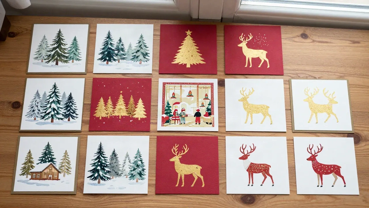
This Midjourney prompts guide covers what actually works for Christmas card design, not what sounds compelling in a tutorial. Midjourney generates some of the most convincing painted illustration available from an AI model right now: watercolor village scenes, vintage reindeer, mid-century flat color compositions. The model has a pronounced strength when you give it clear artistic direction.
The problem is that most guides treat prompts as a magic phrase rather than a brief. A brief has a subject, a style reference, a lighting note, and an intent. A magic phrase is just words.
This is the practical version: how to structure prompts for holiday card art, which parameters actually matter, where the model struggles, and how to get from a Midjourney output to something you would actually hand to a printer.
The prompt structure that produces usable card art
The formula that works consistently across watercolor and vintage styles is: subject + atmosphere + rendering style + color palette + parameters. Each element does a different job, and cutting any one of them usually shows in the output.
Subject anchors the composition. "A snowy pine forest" tells the model what to draw. Atmosphere tells it the emotional register: "at dusk, warm light through cottage windows" shifts the output from documentary to painterly. Rendering style is the instruction you would give a human illustrator: "gouache on cream paper", "screenprint in three colors", "pen-and-ink with watercolor wash". Color palette is the constraint that makes the result printable: "deep forest green, burgundy, and cream, no other colors" keeps the output from going muddy.
Parameters come last, and for card work, two matter most: --ar for aspect ratio, and --stylize. An A5 portrait card is --ar 5:7. A square card for social or digital PDF is --ar 1:1. Standard postcard is --ar 2:3. Set --stylize 200-400 if you want more artistic interpretation; drop it toward 100 if you need the model closer to your literal description.
Watercolor style: where Midjourney has a real edge
The watercolor renders in Midjourney hold up well at print scale, which is not something you can say about every AI generator. The model handles wet-edge blending and the way pigment pools in the lower corner of a wash, the behaviors you would normally spend years learning to control. The catch is that "watercolor" alone is a weak prompt. You need to tell it what kind of watercolor.
"English watercolor, loose brushwork, lot of wet-into-wet bleeding, cream paper showing through" gives you something in the Winsor and Newton tradition. "Japanese watercolor illustration, flat washes, minimal detail, white space" produces a quieter composition suited to a more reserved card. "American mid-century watercolor greeting card, bold graphic shapes, primary palette, flat background" gets you something close to the cards that came out of Hallmark's golden period.
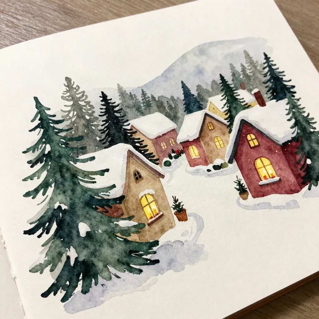
A working watercolor prompt for a snowy village scene: a hand-painted watercolor Christmas card, English watercolor tradition, loose wet-into-wet washes, snowy village at dusk, pine trees in foreground, cottage windows warm yellow against cold blue-grey sky, forest green and indigo with cream accents, no text, cream paper texture, --ar 5:7 --stylize 300 --v 6.1
Iterate on the atmosphere word. "Dusk" produces colder, more atmospheric results than "evening". "Twilight" pulls it toward purple. "Golden hour" warms everything, which reads as festive but can flatten the contrast you want in a printed card.
Vintage and mid-century prompts: how to reference the right era
This is where being specific pays off most directly. "Vintage Christmas card" is doing very little work. The model has to guess which decade, which country, which printing tradition. "1950s American Christmas card, two-color offset lithograph, flat graphic style, reindeer silhouette in deep red on cream background, Hatch Show Print tradition" gives it a period, a technique, and a visual reference it can actually use.
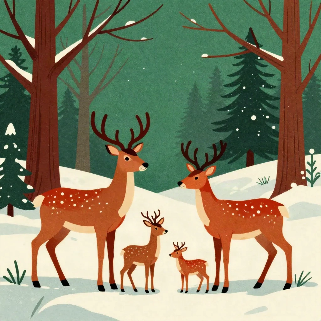
The eras that produce the most distinct outputs:
Victorian (1880s-1900s): Chromolithography look, dense detail, lots of saturated color. Good for elaborate cards with holly, robins, snow scenes. Prompt anchor: "chromolithograph Christmas greeting card, 1890s, rich saturated colors, Victorian illustration style".
Mid-century American (1940s-1960s): Flat graphic shapes, strong silhouettes, two or three spot colors. The aesthetic Christmas Card Factory's own model was trained on. Prompt anchor: "mid-century American holiday card, 1955, flat offset print, two-color, strong geometric shapes".
Scandinavian folk (any era): Simplified animals, repeated pattern borders, natural motifs. Works well for a quieter card. Prompt anchor: "Norwegian folk art Christmas card, nisse and reindeer, flat color, geometric border pattern, red and cream".
For any of these, adding a printing-process reference sharpens the output. Letterpress, woodblock, screenprint, and lithograph each carry visual signatures the model has learned to reproduce from historical printed matter.
Text in Midjourney: the honest assessment
Here is the part most guides skip: Midjourney is still unreliable for legible text in card designs. The model has improved substantially with version 6.1, but type that looks clean in the preview often degrades on close inspection: letters swap, ligatures break, "Season's Greetings" becomes something adjacent but wrong. This is not a workflow-ending problem, but it is a workflow-shaping one.
The practical approach is to generate the illustrated background without any text, then add the message in post. If you have Photoshop or Affinity Designer, this takes under five minutes. When you do prompt for text, use negative-space prompts: "text area reserved at bottom, blank cream space for message" directs the model to leave room without asking it to render type. It does not always work, but it works more often than simply hoping.
The model does better with short, bold display text than with script or handwritten lettering. If you need a "Season's Greetings" treatment that the model renders accurately, specify "bold sans-serif lettering, single word, high contrast" rather than "elegant cursive font". Manage expectations accordingly.
Resolution and print specs: what you actually need
Midjourney's default output runs at 1024x1024 pixels at 72dpi, not print resolution. A standard 5x7 card printed at 300dpi needs 1500x2100 pixels minimum. The model's full-quality outputs are large enough to upscale cleanly, but you need to run them through a proper upscaler first.
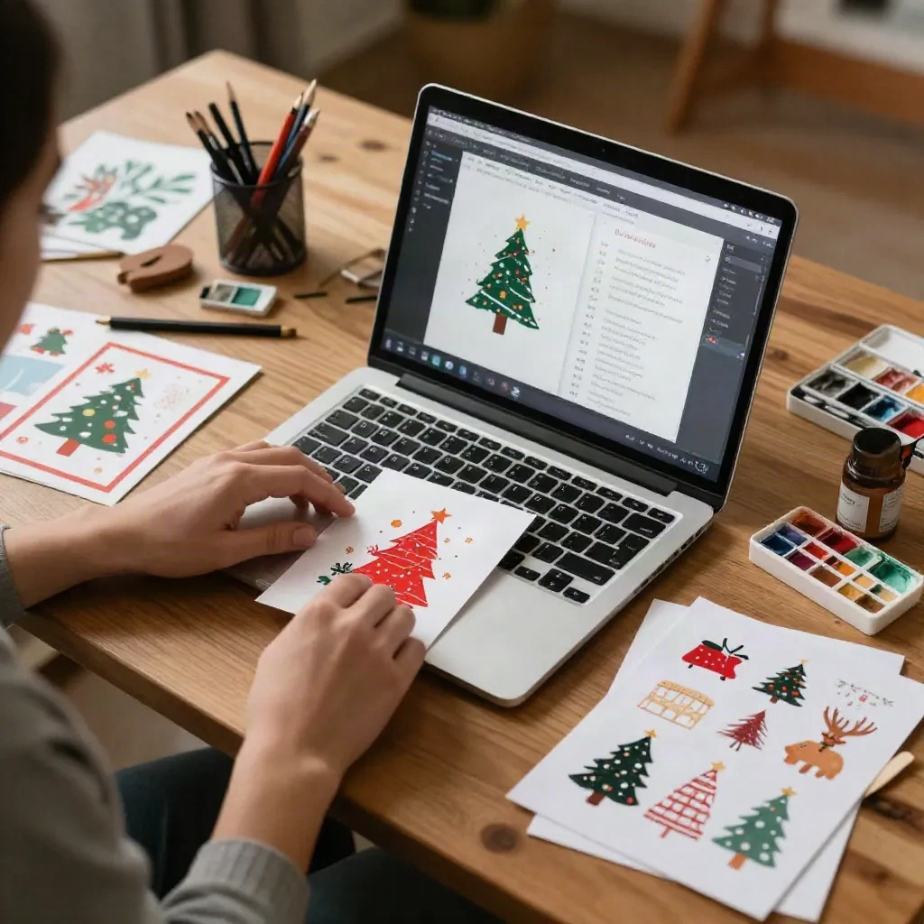
Two options that work consistently: Lightroom's Super Resolution (included in Creative Cloud, doubles resolution with one click) and Topaz Gigapixel (one-time purchase, upscales up to 16x without visible artifacts on painterly outputs). Both handle the texture and brush-edge quality of watercolor renders better than a standard bicubic resample.
After upscaling, convert to CMYK if your printer requires it. Most digital print-on-demand services accept RGB with a color profile, but a letterpress or offset shop will want CMYK, and the conversion from Midjourney's vivid RGB compresses saturation. A test print at actual card size before committing to a run is worth the cost.
Parameters worth knowing for card work
A few settings that change card outputs in ways worth noting:
--chaos 0-10 controls how much variation the model introduces across the four-image grid. At 0, the four outputs are close siblings. At 10, they diverge significantly. For exploring styles, higher chaos is useful. For iterating toward a specific composition, keep it at 5 or below.
--no is the negative prompt flag. --no text, watermarks, ornate borders removes elements the model defaults to adding in "Christmas card" contexts. Particularly useful if you want clean illustration without the decorative frame the model often generates unprompted.
--tile produces seamless repeating patterns, useful for envelope liner designs or wrapping paper, less relevant for card fronts.
--style raw removes Midjourney's default aesthetic processing and gives you a closer-to-literal interpretation of the prompt. On watercolor prompts, this sometimes produces results that look more like actual painted work and less like an AI interpretation of painted work.
What this looks like as a card production workflow
The workflow that holds up in practice: three to five prompt variations at the start, each with a different style anchor. Pick the one with the best composition and iterate on it, adjusting the color palette and atmosphere note with each run. Use Midjourney's Vary (Subtle) function once you have a strong base, preserving the composition while adjusting fine detail. Upscale the final selection, add text in a separate application, convert for print.
That is roughly 20-30 generations to get one card design worth printing, at the Basic plan's generation rate. On a Standard plan, relaxed-mode generation removes the fast-hour constraint, which matters if you are designing multiple card styles in a single session.
For a family Christmas card with a specific photo, the Midjourney workflow requires more steps than a dedicated card tool. You would need to reference an uploaded image and use the model's image-weight parameter to ground the output in the photo. That is a reasonable workflow for a designer who wants full control over the final aesthetic. For someone who wants a painted card from a family snapshot in under ten minutes, a purpose-built tool like the Paper and Pine card builder handles the photo-to-illustration step more directly.
The two tools serve different intentions. Midjourney gives you creative range and control over every visual parameter. A card-specific model gives you speed and a print-ready result from a photo. Both produce painted illustration; only one requires you to know what --stylize 300 means.