How to Colorize Black and White Photos for Holiday Cards
Summary
To colorize black and white photos, scan the print flat at 600 dpi, neutralize any sepia, then run it through an AI colorizer such as Photoshop's Colorize neural filter, Canva's Colorify or Fotor. The AI only guesses, so correct skin, clothing and sky by hand on separate layers at low opacity, and verify any colour you can check. Keep the original, soften saturation for print, and proof one card on matte paper before ordering a batch.
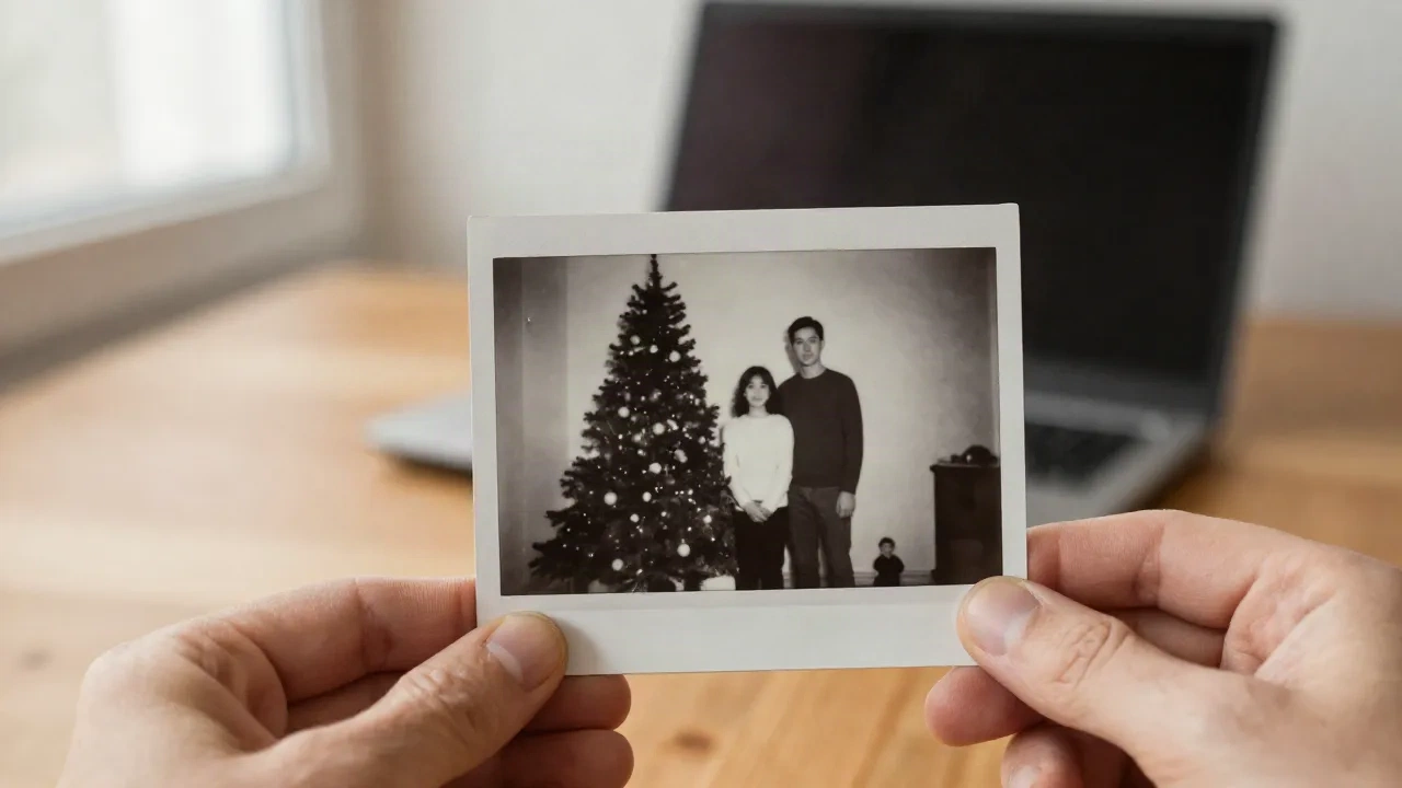
Here is how to colorize black and white photos: scan the print at 600 dpi, run it through an AI colorizer (Photoshop's Colorize neural filter, Canva's Colorify app or Fotor all work), then fix skin, clothing and sky by hand with layers set to a low opacity. Check any colour you can verify, such as a uniform or a front door. Save the original, and only then drop the result into a card.
That is the short version. The longer one is mostly about what the software gets wrong, because it gets the same things wrong every time.
Why colorize an old photo at all?
Because the people in it stop looking like a different species. A grandmother in 1948 grey tones reads as history. The same woman with a plum cardigan and slightly flushed cheeks reads as someone you could have tea with.
There is also a practical reason that arrives every autumn. A colorized family photo makes a far better Christmas card than a scan of a grey print, and it is one of the few things a card from a template library cannot imitate. Nobody else has your great-uncle beside that particular tree.
Colorizing does not replace the original. Keep both. The black and white print is the record, and the colour version is an interpretation of it.
There is a quieter benefit too. Putting colour on a photo forces you to look at it properly. You notice the pattern on the wallpaper, the brooch on the lapel, the way somebody is holding a cup. Half the value of the exercise is the half hour you spend looking, and it is common to find a date or a name on the back of a print only because you finally turned it over.
What do you need before you start?
Less than you think, but the first step matters more than any tool.
Start with the scan. A phone photo of a print under a lamp gives you glare and a colour cast that the AI will happily read as information. Use a flatbed scanner at 600 dpi if you have one, or a scanning app held flat in even daylight. Wear cotton gloves if the print is fragile, and brush off dust before it goes on the glass.
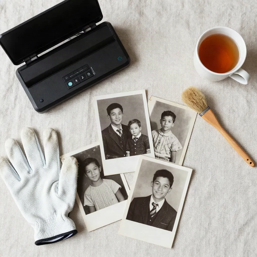
Then look at the tone of the print. If it is sepia or yellowed, convert it to neutral grey first. Adobe's own guidance is to add a black-and-white adjustment layer to neutralize the colour and a Levels layer to fix the contrast before applying the colorizer. A brown cast confuses the model, and you end up with brown faces.
Finally, spot-heal the dust and scratches. Every fleck you leave becomes a coloured fleck afterwards.
Save the scan as a TIFF or a high-quality PNG, not a heavily compressed JPEG. Every round of JPEG compression eats a little of the fine grain that the colorizer uses to tell a sleeve from a wall, and you will not get that detail back. Work on a copy, never on the file you scanned.
Which tool should you use to colorize black and white photos?
Here is where I would skip the hunt for a single winner. Different photos want different tools.
Canva's Colorify app is the lowest-effort route. You upload the photo, open Apps, pick Colorify, click Add color, and compare before and after with a slider. Then you can nudge saturation and the cyan/red, magenta/green and yellow/blue sliders. It is built for speed, not for control.
Photoshop's Colorize neural filter is the one to pick when the photo matters. You duplicate the layer, open Filters, then Neural Filters, switch on Colorize, and adjust. The real advantage is not the AI step, it is what comes after: layers, masks and the ability to change a coat from grey-green to navy without touching the face. It costs about $22.99 a month, which is steep for one photo and sensible for a box of them.
Fotor sits in the middle. It is a browser editor with a one-click enhancer and card templates, and a yearly plan of $47.99 at the time of writing. Fewer controls than Photoshop, more than a plain upload-and-wait website.
A word on the free upload sites that rank for this search. Some are fine for a first look. But read what happens to your file, because a family photograph is not something to hand over casually. And be wary of enhancer apps that bill weekly: Remini, for one, commonly charges around $9.99 per week for Pro, and its billing complaints are well documented.
Skip them all if the photo is badly damaged. Colorizing a cracked, faded print just colours the cracks. Restore first, then colorize.
One more thing about tools: consistency. If you are colorizing a set, say four photos from the same 1950s Christmas for a family card series, run them through the same tool with the same settings. Mixing a Photoshop result with a one-click web result puts two different ideas of skin tone on the same mantelpiece, and relatives notice. It is the kind of detail that is invisible until you lay the prints side by side.
How do you fix what the AI gets wrong?
This is the part most guides cut short. A colorizer predicts the most likely colour for each region. Most likely is not the same as true.
The usual failures are predictable. Skin comes out as one flat beige, when real skin is several hues, with pinker cheeks and cooler shadows. Clothing defaults to muted browns and greys because those are statistically safe. Skies go a uniform pale blue. Anything printed, like a sign or a patterned dress, gets a guess.
Here is the routine I use after the AI pass:
Put the colorized result on its own layer above the original, so you can always peek at the grey.
Pull the global saturation down a notch. Colorizers lean bright, and a 1950s photograph rarely was.
Add a new blank layer for each colour you want to change, set the blend mode to Color, and paint at around 40 to 50 percent opacity rather than 100.
Do skin last, with two or three slightly different tones across the face, and keep the whites of the eyes and the teeth a little less white than you think they should be.
Take History snapshots as you go, so a bad hour can be undone.
PHLEARN's colorization guide makes the same point about opacity and about whites of the eyes in photographs from the 1800s and early 1900s. It is a 2019 walkthrough, but the craft has not changed.
Can you trust the colours?
Partly. And you should say so honestly when you share the result.
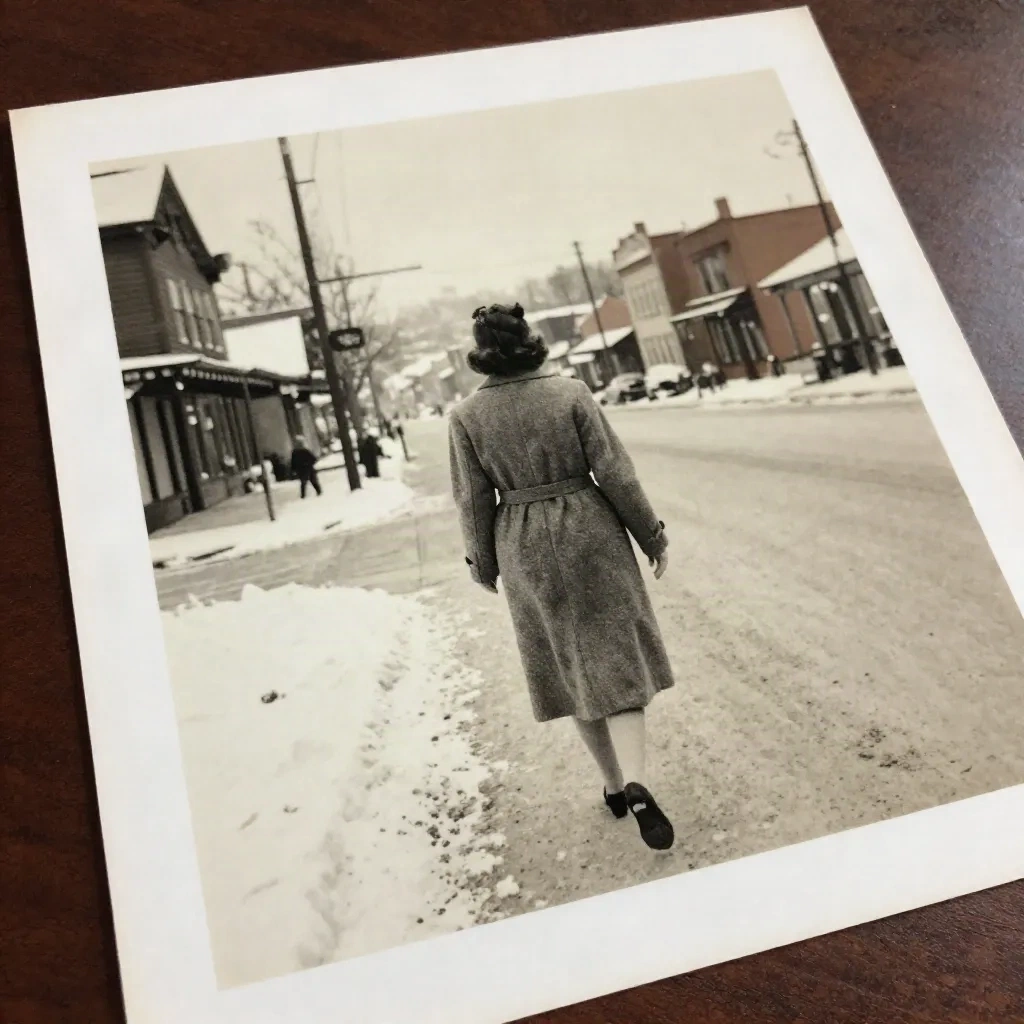
A grey tone in a black and white print does not map to one colour. A mid-grey could be a red jumper or a green one, depending on the film and the light. The software is guessing from patterns in its training data, and when I check results against family memory, the guesses on hair and skin are often decent while the guesses on clothing and signage are close to random.
So do the cheap detective work. Ask a relative what the front door was painted. Look at the back of the print, where someone often wrote a date. If the photo shows a uniform, a school blazer or a football strip, look up the real colours, because those are the details a relative will spot immediately.
If you cannot verify a colour, pick something plausible for the era and leave it muted. A slightly dull coat that could be right is better than a vivid one that is certainly invented.
What happens when it goes on a Christmas card?
Colour behaves differently on paper than on a screen, and a colorized photo is more sensitive to it than a normal holiday snapshot.
Screens glow. Paper does not. A colorized image that looks restrained on your laptop can print noticeably flat, and one that looks vivid on screen can print muddy. Soften the saturation a touch if the plan is a printed card, and order a single proof before the whole batch. Here is the thing about paper: a matte 300gsm stock will take those gentle colours well, while a glossy template stock tends to make them look synthetic.
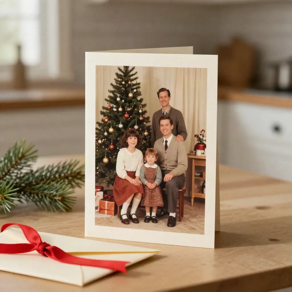
Resolution matters too. The 600 dpi scan you made at the start gives you room to print at card size. A small phone snap blown up to a front panel will not.
If you only need a few cards, an online printer is the sensible route. Vistaprint, for example, has items from around $8 and a deep customization menu, though its checkout upsells are persistent and print quality varies by product line, so proof first.
And if what you want is a card that looks illustrated rather than merely tinted, that is a different job entirely. A colorized photo is still a photograph. A watercolor or vintage postcard rendering turns it into something painted, and that is what we do at Christmas Card Factory.
Is there a cleverer way than colorizing everything?
Sometimes, yes. Not every old photo needs colour.
A black and white print on a Christmas card can look better than a colorized one, especially when the photo is a good composition with strong contrast. Colour adds information, but it can also add a slightly artificial feel if the original lighting was doing the emotional work.
My own rule of thumb is to colorize when the photo has people in clothing and settings that colour helps you recognize, and to leave it alone when it is a formal studio portrait with dramatic lighting. If you are sending one card, try both and put them side by side on the desk for a day. The answer is usually obvious by the next morning.
Before you hit print
Scan flat at 600 dpi. Neutralize sepia. Run the AI pass once, then do the human pass slowly. Verify what you can, mute what you cannot, and keep the black and white original filed next to the colour version.
Then proof one card on proper paper before ordering fifty. It takes a week, and in the middle of December a week is the difference between a card in the post and an apology on the 27th.