Best Midjourney Prompts for Christmas Card Art, Tested
Summary
The best Midjourney prompts for Christmas cards name one medium, set a printable ratio like --ar 5:7, and ask for empty space where your message goes. Watercolor, cut paper and linocut translate to print best because they use limited color. Leave the greeting text out of the image, keep --chaos low, use --sref to keep a set consistent, and always print one proof on your real card stock before ordering.
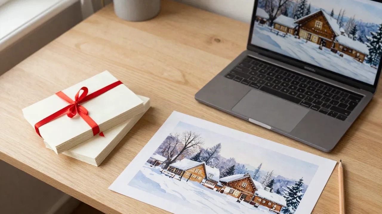
The best Midjourney prompts for a Christmas card share three traits: a named medium (watercolor, cut paper, linocut), a printable aspect ratio like --ar 5:7, and a plain instruction to leave room for your message. Everything below is written for cards that get printed and mailed, not for a screen. Copy a prompt, swap the subject, and check the result at actual card size before you order anything.
Why do the best Midjourney prompts for cards look different from gallery prompts?
Here's the thing about paper: it forgives nothing a screen hides. A prompt that gives you a glowing, hyper-detailed fantasy scene on a monitor turns into a muddy, overworked rectangle on 300gsm stock. Midjourney's own documentation says the real gains come from mixing artistic mediums, time periods, environments and colors, so that is where we start.
For cards, we care about four things that gallery prompts ignore. The image must fit a 5x7 or 4x6 proportion. It needs quiet space where a greeting can sit. The palette has to survive CMYK, which is narrower than what your screen shows. And the illustration should still read when it is held at arm's length in a mailbox.
Skip anything that ends in "8k, ultra detailed, masterpiece". Those words push the model toward density, and density is the enemy of a card. Ask for less. A card with one confident subject and a lot of paper around it looks expensive. A card with forty small details looks like a puzzle box.
What does a Midjourney prompt for a Christmas card actually need?
Build every prompt in the same order: subject, medium, palette, composition, then parameters. The parameters always go last. Midjourney's docs are blunt about it: parameters sit at the end of the prompt, there is a space before the dashes, and no punctuation after them. A prompt that puts text after --ar gets misread.
Four parameters do most of the work on cards:
--ar 5:7gives you the proportion of a standard 5x7 card. Use--ar 7:5for landscape and--ar 2:3for a 4x6.--no text, letters, wordscuts down on the garbled lettering that shows up on fake signs and banners. It does not eliminate it, so check.--stylizecontrols how much artistic license the model takes. For cards, lower values keep the subject closer to what you wrote.--srefreuses the look of an image or a style code, which is how you keep a whole set of cards consistent.
One practical note on cost. Midjourney has no free tier, and plans start at about $10 a month, so you are paying to experiment. Draft mode exists to spend fewer GPU minutes while you test wording. Use it for the first five rounds, then switch to full quality for the final render.
Which watercolor prompts hold up in print?
Watercolor is the safest place to begin, because paper grain and soft washes are what the model is good at and what a printer reproduces well. The trap is over-saturation. Left alone, Midjourney pushes blue and red harder than a press will.
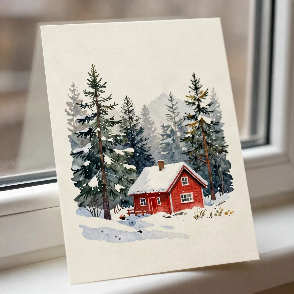
Snowy cabin, portrait card. loose watercolor illustration of a small red cabin in a snowy pine forest, muted blue and cream palette, generous empty sky at the top, visible paper grain, soft edges --ar 5:7 --no text
Front door with a wreath. watercolor painting of a green front door with a simple evergreen wreath and red ribbon, snow on the step, pale grey background wash, lots of white paper around the subject --ar 5:7 --no text
Winter village, landscape card. soft watercolor winter village at dusk, warm yellow windows, cool blue shadows, wet-on-wet sky, plenty of negative space --ar 7:5
Notice what is not in there: no artist names, no quality adjectives, no "beautiful". The words "muted" and "generous empty sky" do more than any compliment. If the first result looks too busy, do not rewrite the whole prompt. Add "minimal" once and lower --stylize.
What about cut paper, linocut and other print-friendly styles?
Midjourney's prompting guide lists block print, risograph, cut paper, cross stitch and cyanotype among its example mediums, and those are the ones that map onto real printing. They work for cards because they are flat and limited in color, which is what a press likes.
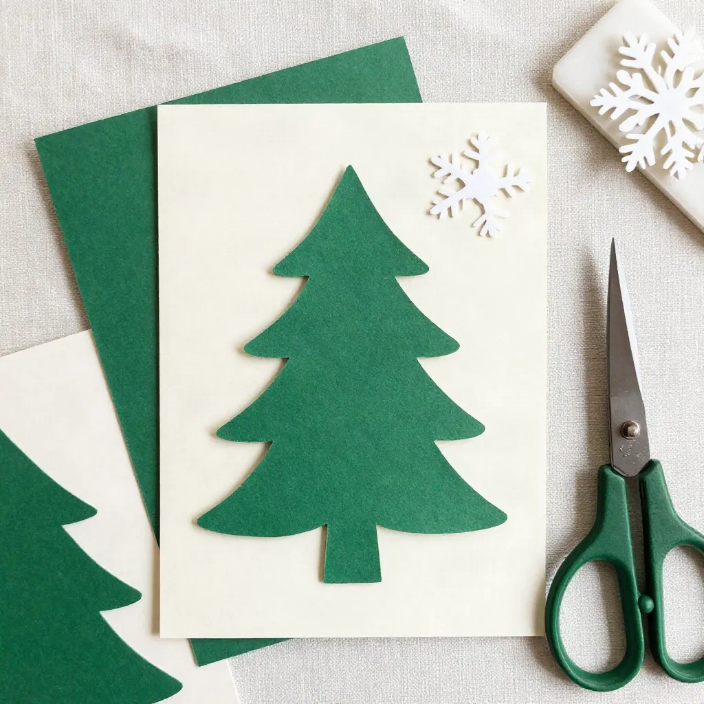
Cut paper. layered cut paper Christmas tree in deep green and cream, subtle drop shadows between layers, snowflakes, flat lighting, plain cream background --ar 5:7 --no text
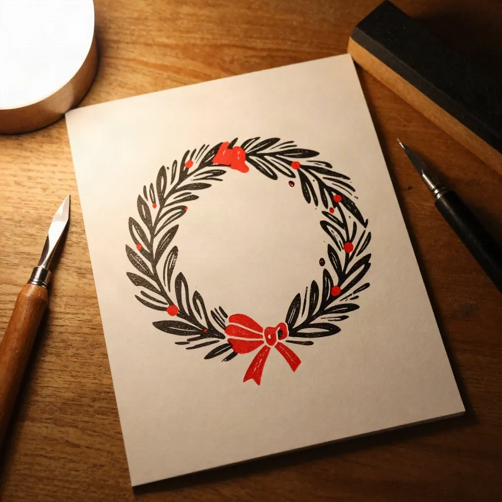
Linocut wreath. linocut block print of a holly wreath with a bow, two ink colors only, black and vermilion red, rough carved edges, cream paper texture --ar 5:7 --no text
Risograph reindeer. risograph print of a reindeer in a snowy field, two spot colors, red and teal, slight misregistration, grainy overlay --ar 7:5
Cross stitch. cross stitch pattern of a small Christmas tree on linen fabric, limited palette, visible thread texture --ar 2:3 --no text
The two-color instruction is the trick. "Two ink colors only" is a print constraint, and the model respects it surprisingly well. You end up with an image that separates cleanly for printing, which a full-color painterly render never does.
Which prompts should you skip?
A short list of things everyone recommends that we would not use on a card.
Skip prompts that ask for the greeting itself. Writing "Merry Christmas" inside the image is the most common request and the most common failure. Even when the letters come out right, you cannot fix a typo without regenerating the whole image, and the type looks pasted on. Generate the art without text, then set the words yourself in a layout tool, or use an image model built for lettering such as Ideogram, whose strength is legible in-image text.
Skip "family portrait" prompts. A model asked for "a happy family of four" gives you four generic strangers, and the point of a family card is that it looks like your family. Midjourney documents an Omni Reference feature for using a person's likeness, but the parameter list notes it was replaced by an Edit model in the V8 line, so check which version you are on before you build a workflow around it.
Skip --chaos at high values. It is fun for exploring, and useless when you are trying to land one specific card. Keep it at zero once you have a direction.
Skip celebrity, character and brand references. Beyond the obvious rights problem, the results tend to look like fan art, and they age badly in a drawer of keepsakes.
How do you keep a set of cards consistent?
If you send the same style to your whole list, you want it to look like a series. The way to do that is a style reference. Midjourney's docs describe --sref for matching the look and feel of an image, --sw to control how strongly it applies, and style codes, including --sref random to discover one. Find a render you like, reuse its style, and change only the subject for each card.
Two cautions. Style versions change: the docs describe --sv 4 as the old V7 style-reference model from before June 2025, so add the version explicitly if you want a result you can reproduce next December. And keep a text file of every prompt that worked. Nobody remembers the exact wording of a prompt from ten months ago, and Q4 comes around fast. Portland, mid-October: that's when this becomes a full-time job.
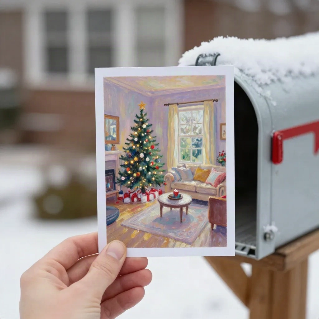
What breaks between screen and mailbox?
Three things, in the order we see them.
First, resolution. A 5x7 card at 300 dpi needs 1500 by 2100 pixels, so check the pixel dimensions of your final image before you send it anywhere. Midjourney's V8.1 docs mention an --hd option for 2048px images and --sd for standard 1024px, so pick deliberately.
Second, color. Deep saturated blues and neon reds shift on press. Ask for "muted" and "limited palette" up front rather than fixing it later.
Third, edges. Keep the subject away from the border, because trimming can shave a few millimetres. That is why every prompt above asks for empty space around the subject.
None of this is exotic. It is the same checklist a print shop runs on any artwork, and it costs you ten minutes.
Should you prompt yourself, or hire it out?
Honest answer: it depends on what you need the card to say. Midjourney is a strong choice if you like the process, want stylized art of a scene, and do not need your own faces on it. Expect an evening of iteration per design, and a monthly fee.
If you want a family photo turned into a painted card, a general image generator is the wrong tool, because it cannot start from your photo the way a purpose-built card service can. That is what we built ours for, and yes, we are biased. For a fully illustrated commission from a human, Minted sources designs from independent illustrators, with real quality at illustrator prices. Custom commissions run $150 or more per design with roughly a three-week turnaround, versus a same-day AI render.
Before you hit print
Pick one medium. Write the prompt in the order subject, medium, palette, composition, parameters. Set --ar 5:7, add --no text, and ask for empty space. Render at draft quality until the composition is right, then render once at full quality. Add the message yourself.
Then print one proof on the paper you plan to use. You'll notice the difference at 300gsm, and it is much cheaper to find a muddy sky on one proof than on sixty cards. The prompts here are a starting point, and the second thing you write will always be better than the first.
For reference, the two documents worth bookmarking are Midjourney's own parameter list and its Art of Prompting guide. Both are short and both are kept current.