AI Oil Painting: Turn Your Family Photo into a Card
Summary
AI oil painting transforms a standard family photo into a card that looks hand-painted in oils, with visible brushstrokes and a layered palette, in about 30 seconds. The model trained on mid-century illustrated cards renders impasto texture and warm pigment tones that hold up at 300gsm. Worth using if you want a card that looks illustrated. Not a filter, not a frame.
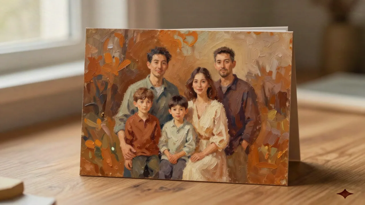
An AI oil painting generator takes a photo you shot on your phone and returns something that looks like it spent six weeks on a studio easel. The output, when the model is well-trained, carries real brushstroke character: impasto ridges, glazed shadows, the kind of warm cadmium palette that reads differently in print than on a screen. That's what makes it interesting for holiday cards. Not a filter on top of a photo, but a genuine rendering into a painted idiom.
Here's the thing about paper: when you print an AI oil painting on 300gsm, the brushstroke texture becomes tactile in a way that a JPEG on a phone screen completely misses. The weight of the card and the visual weight of the painting work together. That combination is what separates this from adding a Photoshop filter and calling it done.
What the model actually does with your photo
The model trained on mid-century illustrated cards works through five steps that happen invisibly in about thirty seconds. It reads the composition, identifies where the light falls, converts color values into painted pigment equivalents, generates brushstroke direction based on the subject's form, and applies a texture layer that simulates canvas grain or paper tooth.
What it does well: faces with clear lighting, winter outdoor scenes with strong contrast, and subjects photographed against simple backgrounds. The model fills in the mid-tones with rich sienna and ochre, and the shadows go deep brown rather than flat grey, which is what makes the result look painted and not filtered.
What it struggles with: glasses catch the light in ways that confuse the rendering, fine hair detail at the edges tends to blur into the background color, and low-resolution source images produce a muddy result that no post-processing will rescue. Start with a photo that's at minimum 1000 pixels on the short side, ideally more.
The four oil painting styles and which one prints best
The model offers four rendering approaches, and they behave differently at the print stage:
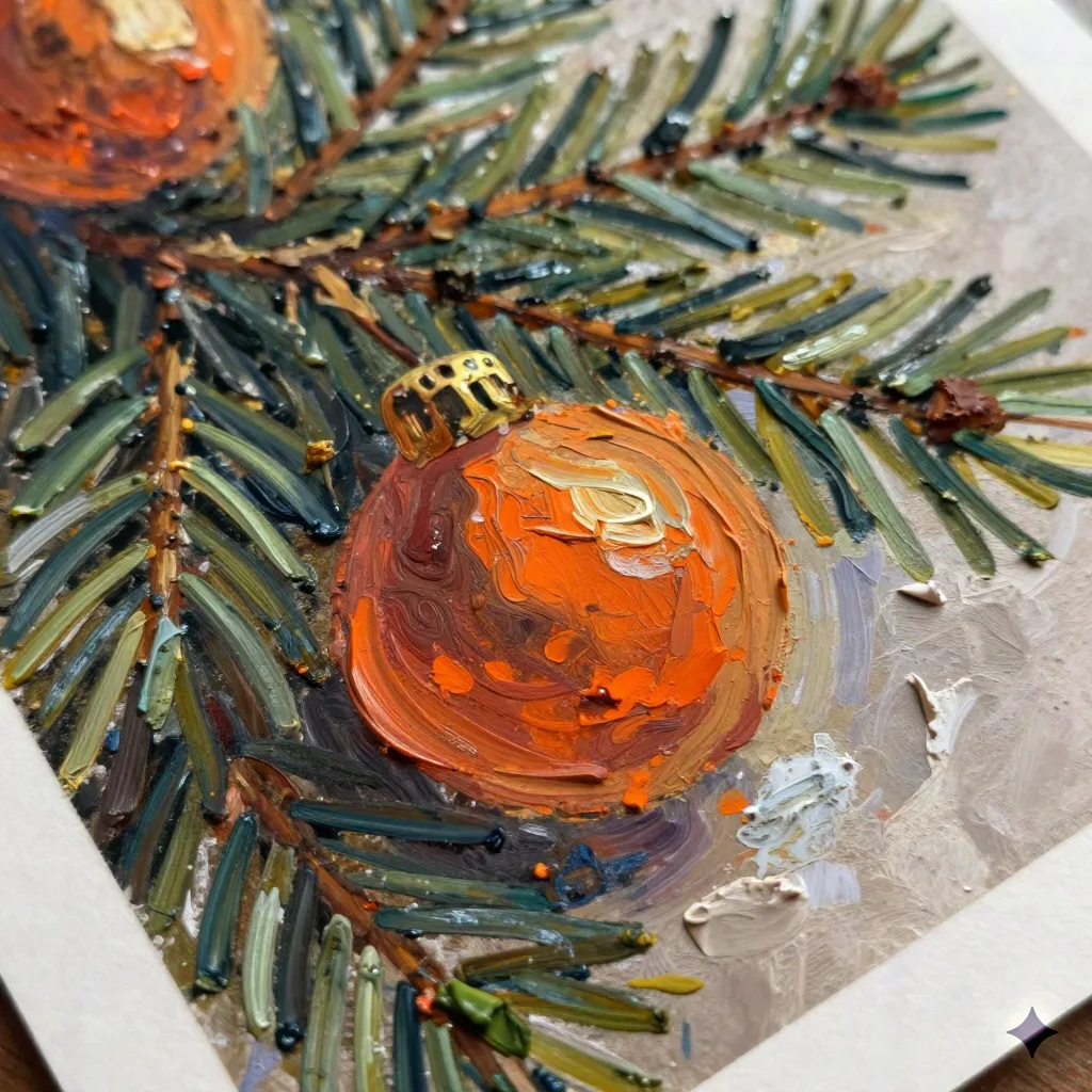
Impasto applies thick paint, palette knife marks visible, a dimensional look that photographs well but requires the right paper to land correctly. At 300gsm matte, it holds. On glossy stock, it looks like a scan of a texture, which is different from what you want.
Realist uses smoother brushstrokes, closer to a traditional portrait commission, less ostentatiously painted. Better for family groups where you want everyone to be recognizable rather than impressionistic.
Vintage postcard renders the scene in a mid-century Americana palette, flat color areas with expressive outlines, influenced by the illustrators who made holiday cards from the 1940s through the 1960s. This is the style the model was specifically trained on and where the output is most consistent.
Oil pastel digital is the softer option, chalky transitions, less aggressive texture, works well when the source photo has soft light or a lot of sky in the background.
If you're printing: Impasto and Vintage postcard are the two styles that translate from screen to paper without loss. Realist can look flat if the paper doesn't have enough tooth. Oil pastel digital needs a warm paper color to sing.
How photo quality changes the painted output

The model is not forgiving of source image problems. A blurry photo produces a blurry painting. An overexposed photo produces a painting with blown-out highlights that look like unpainted canvas. An underexposed photo produces a painting that's all shadow with no midtone definition.
The three things that actually improve output:
Shoot in diffuse light, not direct sun. Midday sun creates harsh shadows across faces that the model reads as strong form edges and exaggerates in the rendering. Overcast light, or the light from a window on a grey day, gives the model clean gradients to work with. You'll notice the difference in the cheeks and the area under the chin.
Keep the background simple. A cluttered background becomes a painterly mess of competing color shapes. A plain wall, a stand of trees with out-of-focus detail, a front door painted a solid color: all of these let the model focus its texture work on the subjects rather than trying to resolve every leaf and fence post.
Don't over-edit the source photo before uploading. Filters add color casts that the model then tries to paint around, creating incoherent palettes. A straight photo from the camera, with basic exposure correction if needed, gives the model accurate information to work from.
The gap between a good AI oil painting and an expensive commission
A commissioned oil portrait from a working illustrator currently runs $300 to $800 for a family group, with a six-to-ten-week turnaround depending on the artist's schedule. The AI oil painting is thirty seconds and the cost is included in the card price.
The difference is real but not always decisive for a holiday card. A commissioned painting will have compositional choices an illustrator makes deliberately: where to place the horizon line, how much to simplify the background, which family member's expression to lean into. The AI model makes those choices based on training, which is consistent but not personalized in the same way.
For most people sending holiday cards, the goal is a card that looks painted rather than photographed, arrives looking substantial in the hand, and doesn't require three weeks of back-and-forth with an Etsy illustrator. The AI oil painting delivers that. Skip it if you want a genuine commission that will hang in a frame for twenty years. Use it if you want a card that looks like it was illustrated for your family specifically, at a price that makes sending sixty copies sensible.
What 300gsm feels like when you're holding the result
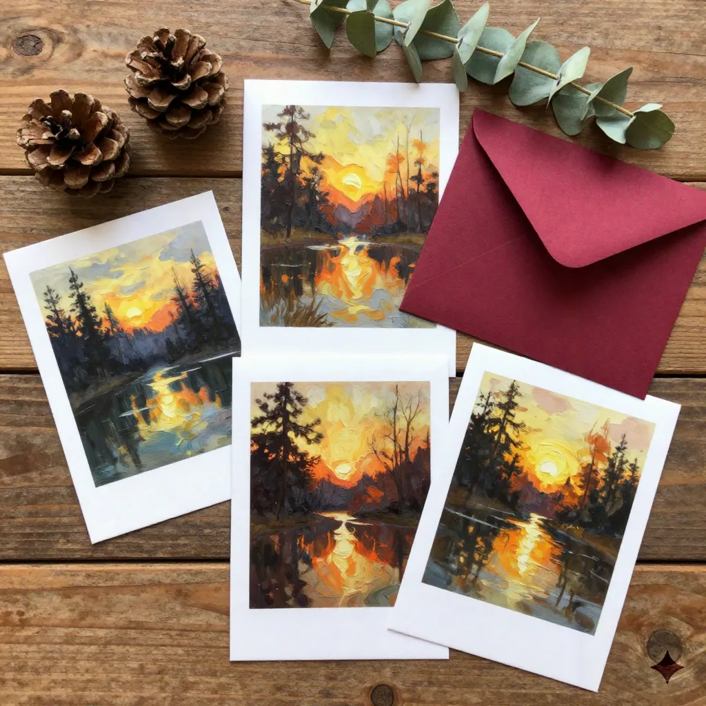
You'll notice the difference at 300gsm before you've looked at the image. The card resists at the fold in a way that 250gsm doesn't. It lies flat on a table without curling toward the envelope. When you hold it at an angle to the light, you can see the paper surface. That surface, combined with the printed brushstroke texture from the oil painting rendering, creates a card that reads as made rather than produced.
The finish matters too. Matte laminate on an AI oil painting is the correct call. Gloss flattens the perceived depth of the brushstrokes and makes the card look like a photograph of a painting rather than a printed painting. The difference is subtle on screen and significant in person.
Print runs of thirty to sixty cards make the most sense economically. Below thirty, the per-unit cost starts to look like a Minted custom commission but without the illustrator's bespoke choices. Above sixty, you're in Shutterfly territory on price per card, with the difference that the image actually looks like it was made for your family.
When a photo doesn't survive the painting process
Some photos genuinely do not make good AI oil paintings. Not because the photo is bad, but because the subject or the lighting doesn't suit what the model does.
Group photos where people are standing more than six feet apart often render badly because the model tries to maintain consistent scale and the result looks like four separate paintings stitched together. Photos taken in mixed artificial light, the kind you get at most indoor holiday parties, produce paintings with color casts that read as artistic choices rather than technical artifacts, and not usually in a flattering direction.
The clearest signal that a photo won't work: if you look at the image and the faces are the same size as the background elements, the model will flatten everyone into the scene. You want the faces to dominate the frame. Vertical compositions with one or two people, shot from the waist up, produce the most consistent painted output.
If the photo doesn't work, retake it rather than trying to fix it in software. The model works with what you give it, and there's a ceiling to how much a good model can do with a bad source.
Before you hit print
Proof the digital file at 100% zoom before approving the order. The AI oil painting rendering sometimes softens fine detail in ways that aren't visible at thumbnail size but are obvious when you zoom into someone's face. If the eyes look blurred, or the painting has lost the person's likeness in favor of a generic painted face, go back to the source photo and try again with better input.
One thing worth checking: the color temperature of your screen. Most laptop displays skew warm, which means AI oil paintings look different on a calibrated print monitor than on your laptop. If you're concerned about color accuracy, print a single test card before committing to the full run. Six days from Portland to your door, so order the test early enough to adjust.
The painted result should make the recipient pause for a second when they pull it out of the envelope. Not because it's technically impressive, but because it looks like someone chose to have the card made rather than assembled. That pause is what a real card does that a template doesn't.