What AI Generated Landscape Art Really Looks Like in Print
Summary
An AI generated landscape looks different on paper than it does on a screen. Watercolor and oil pastel renders hold their structure on 300gsm matte stock; photorealistic snow scenes tend to fight the ink and come out muddy in the midtones. Models trained on mid-century illustrated cards handle winter terrain with more compositional confidence than general text-to-image tools. This covers what to prompt for, which tools to test, and what to check before you order the print run.
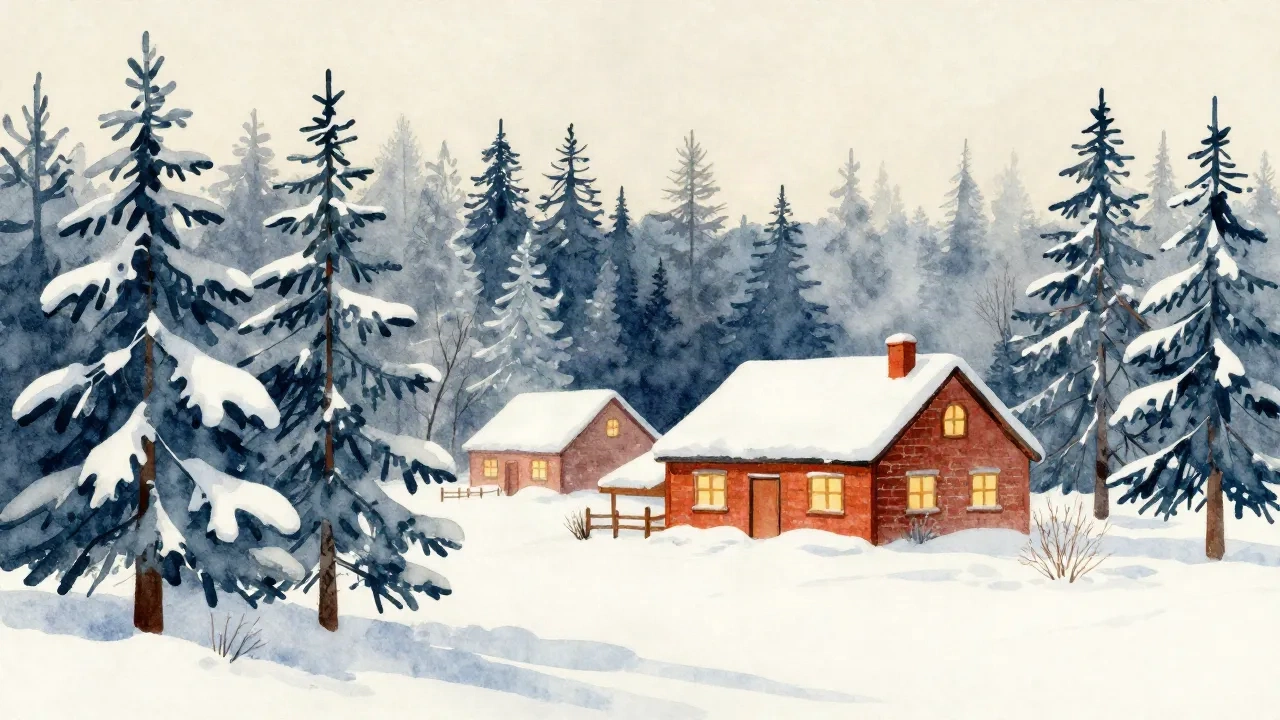
An AI generated landscape is a specific kind of file. It is not an illustration in the traditional sense, it is not a photograph, and it is not a rendering of a real place. It is what happens when a model trained on millions of images tries to produce what "winter morning, snow-covered pines, farmhouse with smoke from the chimney" looks like from the inside out.
That sentence describes roughly what the Paper & Pine model at Christmas Card Factory has been doing since 2023. But it also describes what Midjourney does, what Playground AI does, and what Ideogram does. The difference between them is not whether they can generate a winter landscape. They all can. The difference is what that landscape looks like once it is on paper, and whether it still holds together at arm's length.
This is what two years of printing them has taught us.
What "AI generated landscape" actually means depends on the tool
The phrase covers a lot of ground. A photorealistic AI generated landscape from a tool like Midjourney might look indistinguishable from a drone photo of a Vermont hillside in December. An oil pastel render from Playground AI looks like something a patient, talented person spent two evenings on. A watercolor render from the Paper & Pine model looks like a card that someone kept.
These are not quality differences so much as register differences. One reads as photography. One reads as art. One reads as illustration.
For Christmas cards, the register matters more than the resolution. The people who still send Christmas cards by post are, by definition, choosing the physical object over the digital convenience. A card that arrives looking like a stock photo of a snowy hillside is not that different from sending someone a link. A card that arrives looking like an illustration done for a specific family, in a style that connects to something older than digital photography, that is the thing that ends up on a refrigerator door in early December and stays there until the new year.
None of this means photorealistic AI landscape art is wrong for cards. It means you should decide which register you are working in before you start generating, because the paper stock, the printing method, and the final feel of the card all depend on that choice.
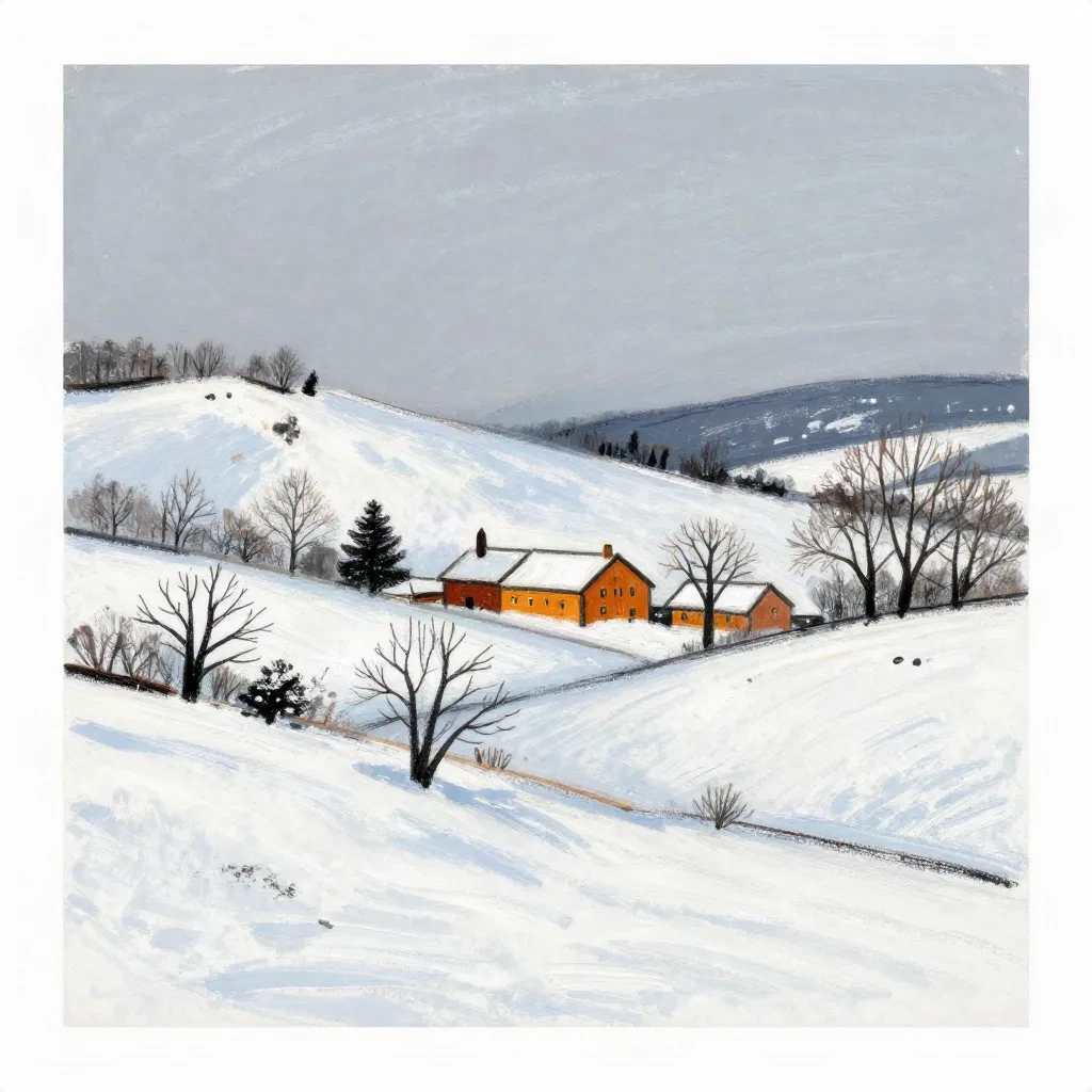
Watercolor and oil pastel renders hold better at 300gsm than photorealism does
Here's the thing about paper. When you print a photorealistic image on matte paper at 300gsm, you are asking the stock to do something it was not designed for. Photorealism wants gloss. It wants the ink to sit on the surface and reflect light evenly. Matte 300gsm absorbs. The micro-texture of the fiber eats into fine gradients. A photorealistic snow scene with subtle shadow graduation looks clean on screen. On paper, the midtones go flat.
Watercolor-style AI generated landscapes do not have this problem. The visible brushstroke already accounts for a slightly irregular surface. The white of the snow in a watercolor render is often the white of the paper itself. The ink fills in around it. When the card comes off the press, the effect is additive rather than subtractive.
The same holds for oil pastel renders and for the vintage postcard style. The Paper & Pine model was trained on mid-century illustrated cards from the 1940s through the 1970s, a period when offset lithography was the standard and designers built their color palettes around what ink on coated paper could reliably reproduce. That training shows in the output. The color separations are clean. The sky does not posterize. The deep blue of a winter night comes out as deep blue rather than shifting toward teal in the conversion.
If you are working with a general-purpose AI landscape tool and want to use it for cards, the practical rule is this: choose a painterly style over a photorealistic one, reduce the saturation by about 15 percent before sending to print, and request a soft proof from your printer before you commit to the run.
The prompt vocabulary that gets you a mid-century winter scene
Most people starting with AI generated landscape generation type something like "snowy winter forest" and receive back a technically correct but unremarkable image. The compositional logic of a trained model needs more to work with.
Specific terms that produce more useful results:
Terrain and setting: "snow-laden spruce trees" reads differently from "snowy trees." "Clapboard farmhouse" reads differently from "house." "Smoke rising from stone chimney" reads differently from "chimney smoke." The specificity tells the model which part of its training to reach toward.
Color palette: Including "muted brick red, deep pine green, cream white, midnight blue" constrains the palette before the model makes its own decisions. AI generated landscapes given no color guidance tend toward punchy, oversaturated versions of the reference scene. Card printing does not like oversaturation. The mids get muddy.
Style anchor: Saying "mid-century American illustrated Christmas card style" or "vintage lithograph postcard" gives the model a stylistic register. Saying "oil pastel on toned paper" gives it a surface logic. Both are more useful than "art style" or "artistic."
Lighting: "Overcast winter light, pale blue shadows" will produce something very different from "golden hour snow." Neither is wrong, but one reads as cooler and more restrained, and one reads as warmer and more editorial. Decide before you generate.
What to leave out: No text in the prompt, no people in the landscape unless you are specifically including a family element. Faces in AI generated landscape backgrounds are notoriously inconsistent and pull focus from the scene.
The Midjourney parameter guide has useful reference for aspect ratio and style weight controls, which affect how literally the model follows a style anchor.
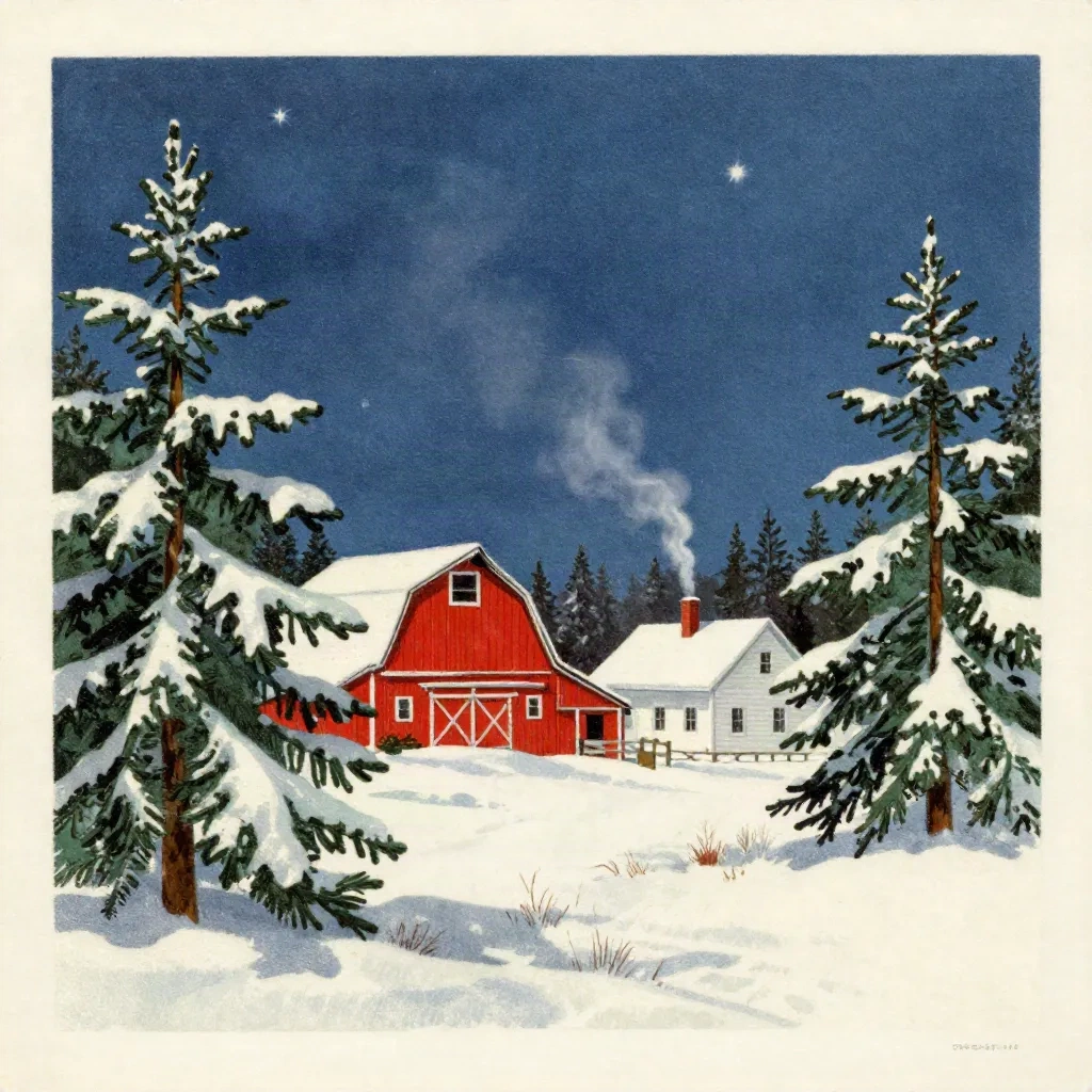
Testing four winter landscape briefs across three tools
We ran the same four prompts through Midjourney, Playground AI, and Ideogram in early 2026. The briefs were: snow-laden spruce trees with red barn in oil pastel style; watercolor New England farmhouse with stone wall and pale morning light; vintage illustrated Christmas card landscape in mid-century night scene; and a minimalist winter landscape with a single tree in graphite and white.
The results were not uniformly better or worse across tools. Each had a register it hit well.
Midjourney handled the oil pastel brief and the minimalist brief with more compositional confidence. The negative space in the single-tree composition was genuinely good. The watercolor farmhouse brief was technically fine but the brushstrokes were mechanically even, distributed in a way that actual watercolor rarely is.
Playground AI handled the watercolor brief better. The wash had more variation. The vintage night scene brief was underwhelming, reading more like a filter applied to a modern image than an actual period illustration.
Ideogram surprised on the vintage brief. The mid-century aesthetic landed. The sky had a lithograph quality that felt period-correct, with the color registration slightly loose in a way that old printing genuinely was. If you are specifically working toward a vintage postcard landscape style for a Christmas card, Ideogram is worth testing before you commit to a tool.
None of these three tools produced output that was immediately print-ready. Each required adjustment: resolution upscaling, saturation reduction, and in some cases a crop to fix the compositional edges. Plan for iteration time, not a single-pass result.
When the sky is right and the foreground is not
The most common failure mode in AI generated landscape art is a split between a convincing sky and a collapsed foreground. The sky is often the first element a model handles well: simple gradient, atmospheric depth, maybe some cloud or star detail. The foreground, which requires actual compositional decisions about what sits where and at what scale, is harder.
If you are iterating, the sky is not usually where the problem lives. Check the horizon line first. Check whether the transition between sky and land reads as coherent or arbitrary. Check the snow ground texture: does it look like accumulated snow or like white paint applied to a flat surface?
The Paper & Pine model handles the transition zone differently from a general generator because it was trained specifically on cards where that zone is the compositional center of the design. The farmhouse sits at the horizon line in proportion to the trees. The trees frame rather than compete with the structure. This comes from the training data, not from explicit instruction: the model has internalized the compositional logic of cards where the design worked.
This is the practical difference between a general-purpose text-to-image tool and a model trained for a specific use case. Both can produce an AI generated landscape. One of them knows what the card format requires.
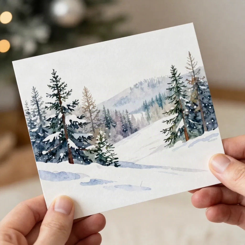
What changes when you add a family photo to the landscape
The other common approach is using an AI generated landscape as a background layer and compositing a family photo into it. This is different from using an AI model to transform the family photo into an illustrated scene, and the results are different in ways that matter.
Compositing keeps the photograph. You are literally placing recognizable people in front of a generated scene. The coherence depends on matching the lighting between the photo and the landscape. A family photo taken indoors under warm tungsten light will not sit naturally in a blue-hour winter exterior. The person reads as pasted-in rather than present.
Photo transformation, which is what the Paper & Pine model does, transforms the photo itself. The family is still present but rendered in watercolor or oil pastel style, integrated into the landscape rather than placed in front of it. The lighting coherence is built into the transformation process.
Neither approach is better in the abstract. Compositing preserves facial accuracy more reliably. Transformation produces a more unified visual register across the whole card. Which matters more depends on what your family looks like and how much the painted quality of the final card matters to you.
Before you send the file to print
The file that looks right on a screen needs to clear three checks before it is print-ready.
Resolution: 300 dpi at the output size. A card at 5x7 inches at 300 dpi is 1500x2100 pixels. Most AI generated landscape outputs from Midjourney or Playground AI can meet this at their native resolution, but check before you order. Upscaling a 1024x1024 output to print dimensions will soften the edge detail noticeably.
Color space: RGB for digital display, CMYK for offset printing. AI generated landscape files are RGB by default. If you are printing digitally on demand, this is fine. If you are going to offset, you need to convert, and conversion will shift the colors. Blues in particular. A midnight blue sky in RGB will shift toward slightly teal in standard CMYK. Request a soft proof.
White point: The paper itself is part of the white in the design. If your AI generated landscape has pure white snow rendered as RGB 255,255,255, and your paper stock is a warm off-white at 300gsm, the snow in the print will look like white paint over cream. This is either a feature or a problem depending on the style. For vintage and watercolor renders, it often works in your favor. For clean modern designs, it does not.
Six days from Portland, Maine to your mailbox. What the card looks like when it arrives is worth getting right before you order a run of a hundred.