AI Art Styles for Christmas Cards: What Prints Well
Summary
AI art styles for Christmas cards are not all equal once you print them. Watercolor is forgiving on skin tones and holds up well on 300gsm matte stock. Oil pastel adds texture but can muddy a busy background. Vintage postcard flattens color in a way some families love and others find dated. Paper-cut works best with one or two subjects and a strong silhouette. We print-tested each style on real family photos, glasses and dogs included, so you can choose before you upload, not after a card has shipped.
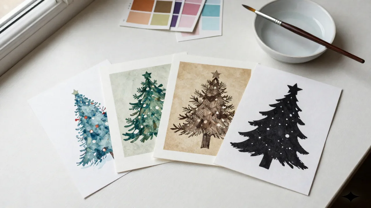
AI art styles look different once they leave a screen and land in an envelope. Here is the short version: watercolor is the most forgiving choice for family photos with mixed skin tones and holds up well at 300gsm. Oil pastel adds real texture but can muddy a cluttered background. Vintage postcard flattens color in a way that reads nostalgic to some and dated to others. Paper-cut is the boldest option, and the least forgiving once you put more than two people in frame. We ran all four through an actual print run before writing any of this.
Watercolor: the style most families ask for, and why it prints well
The first thing you notice at 300gsm is how a watercolor wash sits into the matte finish instead of sitting on top of it. Ink pools slightly at the edges of a brushstroke the way real watercolor does on cold-press paper, which is part of why this style photographs so well in a printed card and so poorly in a low-res screenshot someone sends you from their phone.
Watercolor is also the most forgiving style we render for skin tone variation. Because the model softens edges into a wash rather than a hard line, a family photo with a wide range of skin tones tends to come out even, without one face reading flat and another reading overexposed. Glasses come through as a soft blur of reflected light instead of a hard white rectangle, which matters more than people expect: a family photo with three kids in glasses is a genuinely common upload for us in September and October.
Where it struggles: high-contrast holiday lighting. String lights and a dark room push the model toward blown-out highlights that watercolor cannot soften the way it softens skin. If your reference photo was shot at night with a phone flash, expect a result that looks more like a flash photo than a painting no matter which style you pick.
Worth it if your photo has three or more people, mixed ages, or glasses in the mix. Skip it if you want punchy, saturated color: watercolor reads soft by design, and no amount of prompt tweaking gets it to read like a poster.
Oil pastel: the most textured render, and where it falls apart
Oil pastel is the style people ask for when they have seen it once, on someone else's card, and cannot say exactly why they liked it. What they liked is the texture: visible ridges of color that catch light differently depending on how you tilt the printed card, closer to a real pastel drawing than anything watercolor produces.
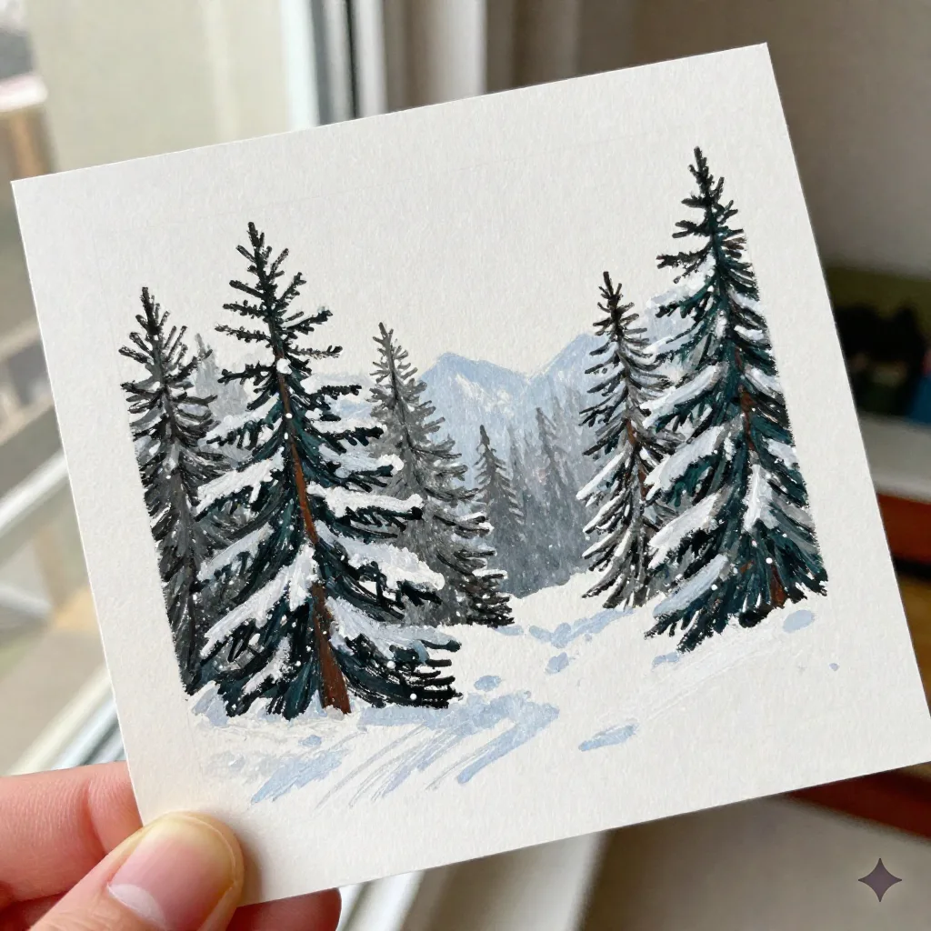
It works best against a single dominant background: snow, a pine tree line, a plain wall. Give it a cluttered living room with a tree, wrapping paper, and a dog bed in frame, and the model starts compressing everything into the same waxy texture, background and foreground alike. You lose the separation that makes a portrait read as a portrait rather than a pattern.
Group size matters more here than with any other style. At one or two subjects, oil pastel holds facial detail cleanly. At four or five, the thicker line work starts to simplify faces into shapes rather than expressions, and you lose the small details, a specific smile, a cowlick, that make a family recognize themselves in the card rather than just recognizing the outfits.
Worth the upgrade if your photo has one clear background element and two or fewer people in the frame. Skip it if your living room looks like ours does every October: three kids, one dog, and a tree that is already shedding needles onto the rug.
Vintage postcard: the style that splits a family faster than the seating chart
Vintage postcard flattens the palette into a muted, slightly warm tritone, the kind of color you associate with a photo that has been in a drawer for forty years. Families either love it immediately or ask us, politely, why their kids look sunburned. There is no middle response we have seen.
The flattening helps in one specific way: it hides uneven exposure. A photo shot half in shade and half in direct sun, which is most outdoor Thanksgiving photography, comes out more even in vintage postcard than in any other style, because the whole palette gets pulled toward the same warm register regardless of the original lighting.
It pairs naturally with our letterpress-adjacent border stock, since the muted color reads as intentional rather than washed out next to a cream card edge. It does not pair well with a photo where bright, modern colors are the point, a red dress, a blue front door, a green Christmas sweater someone bought specifically for the photo. Vintage postcard will mute all of it toward the same warm beige, and if the color was the reason you liked the photo, you will not like the card.
Worth it for outdoor group photos shot in mixed light. Skip it if the outfit colors are doing work in the original photo.
Paper-cut: the boldest style, and the pickiest about who's in the photo
Paper-cut renders as flat, high-contrast silhouette shapes layered against a simple background, closer to a printmaking block than a painting. It is the most graphic of the four styles, and the one that photographs best in a thumbnail, which is exactly why it is the style people screenshot most often from other families' cards.
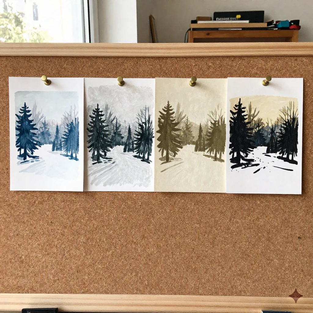
It is also the least forgiving with group size. One or two subjects with a clean silhouette, a parent holding a baby, two kids on a porch step, render cleanly. Add a third or fourth person and overlapping silhouettes start reading as one shape instead of several people, especially if everyone is wearing dark winter coats, which is most of our September and October uploads.
Worth it for a single child or couple photo with a clean outline. Skip it for a full family group shot: the style that looks the sharpest in isolation is the one that handles crowding worst.
Where every AI art style still struggles: glasses, reflections, and busy scenes
This is not a Christmas Card Factory problem specifically. Every generative image model, ours included, still struggles with a narrow set of physical details that our eyes catch instantly and the model does not model as physics. Eye reflections are the clearest example: researchers at the University of Hull found that in a large share of AI-generated portraits, the light reflections in the left and right eye do not match the way they do in a real photo, because the model is predicting plausible pixels rather than tracing where a window or a lamp would actually bounce light. You will not see this at a glance in a printed card the size of an envelope, but it is the same underlying limitation that shows up more visibly as a slightly wrong reflection in a pair of glasses.
The practical takeaway is style-specific. Watercolor's soft edges hide glasses artifacts better than any other style, because a slightly-off reflection reads as a wash rather than a hard error. Paper-cut exposes it worst, since a silhouette with an odd gap where a lens should be has nowhere to hide. If your photo has more than one person in glasses, pick watercolor or oil pastel and skip paper-cut, independent of which style you would otherwise prefer.
Busy backgrounds cause a related problem: the model has to decide what counts as foreground and what counts as texture, and every style we render handles that decision differently. If we had one piece of advice for every family uploading a photo this year, it would be this: crop tighter than feels natural. A photo with less background gives every style less to get wrong.
How Midjourney, Ideogram, and Leonardo render the same brief differently
We get asked, often by people who already use one of the big general-purpose image models, why they should not just run their family photo through Midjourney or Leonardo themselves and print the result.
Midjourney renders gorgeous standalone art. It also was not trained on cards people mailed and kept, it was trained on a much broader art corpus, and it shows: family photos run through general prompts tend toward an illustrated-poster look that reads beautifully at gallery size and loses coherence at card size, where fine detail in a face has to survive a four by six inch matte print, not a screen at full resolution.
Ideogram handles text and graphic composition well, which is not the problem we are solving. A Christmas card rarely needs typography baked into the art; it needs a face that still reads as that specific person once it is 300gsm and six inches wide.
Leonardo gives more granular style control if you are willing to iterate for twenty or thirty minutes on prompt weights. That is a reasonable trade for a poster you are framing. It is a worse trade for a card you need finished before your address list goes stale, which is most of ours by the second week of November.
Shutterfly, Minted, and the case for a card that still looks painted
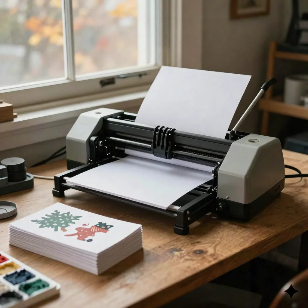
We are not going to tell you Shutterfly cards are soulless. Shutterfly handles volume well, ships fast, and if you want a foil border on a photo collage, they are genuinely fine at it. The template library runs out of steam quickly if what you want is a card that looks like it was illustrated for your family specifically rather than fitted into a layout built for thousands of other families.
Minted sits at the other end: real illustrators, real commissions, and a result that can look extraordinary. It also runs $150 and up for a custom illustration with a three-week turnaround, against roughly three dollars a card and a thirty-second PDF here. If you have three weeks and the budget, Minted's illustrators are worth it. If you are printing this weekend, they are not an option at all.
The demand for a physical card, painted or not, has not gone anywhere. A 2026 industry survey of 2,000 US adults found that two out of three people still prefer to receive a physical greeting card over a digital one, including 62 percent of Millennials and 59 percent of Gen Z, and Americans buy more than 6.5 billion greeting cards a year. Nobody is choosing between a painted style and an e-card. They are choosing between one printed style and another, and that is a narrower, more answerable question.
Before you upload your photo
Pick watercolor if you have three or more people, any glasses, or mixed lighting. Pick oil pastel if you have one or two people against a single clean background. Pick vintage postcard if your photo was shot outdoors in uneven light and you like a warm, muted palette. Pick paper-cut only if you have one or two subjects with a clean, uncluttered silhouette.
Crop tighter than feels natural, keep the group to what the style can actually hold, and if two people in the photo wear glasses, let that decide the style before anything else does. The card that ends up on someone's mantel is the one that survived the print, not the one that looked best on your phone at 2am while you were choosing.