AI Art Prompts for Christmas Cards That Actually Work
Summary
AI art prompts for Christmas cards work best when they name the style explicitly -- watercolor, oil pastel, vintage postcard, or paper-cut -- define the palette in specific hue terms, and constrain what the output should avoid. This guide covers prompt anatomy for all four styles, explains why generic prompts fail in print, and addresses where photo-input models outperform text-only generation for family holiday cards.
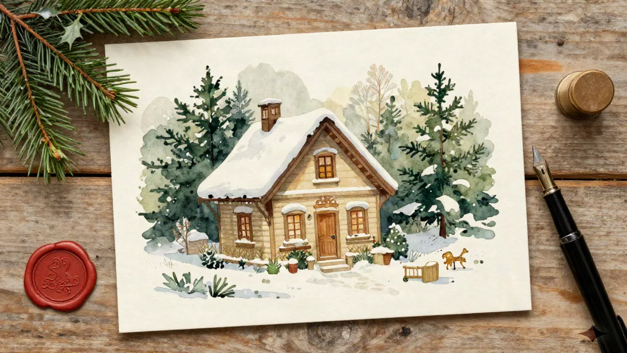
The search for good AI art prompts for Christmas cards usually starts the same way: someone opens Midjourney or Stable Diffusion, types something like "Christmas card watercolor style with snowy village and warm light," hits generate, and gets a result that is technically fine and completely forgettable. The composition holds together. The palette reads as festive. Nothing about it looks like it was made for a specific family or mailed with any particular intention.
That is not a failure of the tool. It is a failure of the prompt. Specifically, it is a failure to understand that Christmas cards have a visual grammar of their own, and that grammar does not map cleanly onto the defaults that AI image models reach for when given loose seasonal keywords.
What separates a Christmas card prompt from generic AI holiday art
A card is a printed object meant to be held at a distance, read in about three seconds, and experienced alongside several other cards that arrived the same week. It rewards restraint in a way that gallery art does not. One clear focal point, a palette that reads from five feet away, enough negative space that the recipient can still find a place to write your name and a short note on the back.
Generic AI holiday art is optimized for screen. It is often oversaturated, dense with competing detail, and built around visual contrast that makes sense at 72 DPI and goes wrong when printed on matte stock at 300gsm. The card that looked luminous on your monitor arrives looking flat. The highlights are washed out. The shadows are muddy. Nobody blames the printer, but the printer is usually fine.
The prompt is where the problem starts. Writing it the way you would describe a painting you want to hang on a wall produces a painting you might hang on a wall. Writing it for a printed card that needs to survive a mailbox, a December mantle, and the short attention span of someone who got eleven cards this season requires a different approach.
The four styles your prompt needs to name
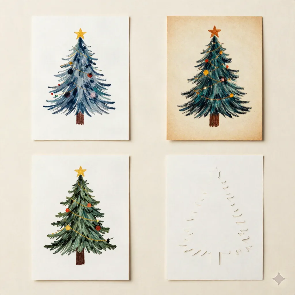
The style reference is the most consequential keyword in any Christmas card prompt. Without a named style, the model defaults to its most statistically common interpretation of "Christmas card" -- which in 2026 leans heavily toward oversaturated digital illustration with aggressive specular highlights that print poorly on anything other than glossy photo stock.
These four styles each require a different prompt structure:
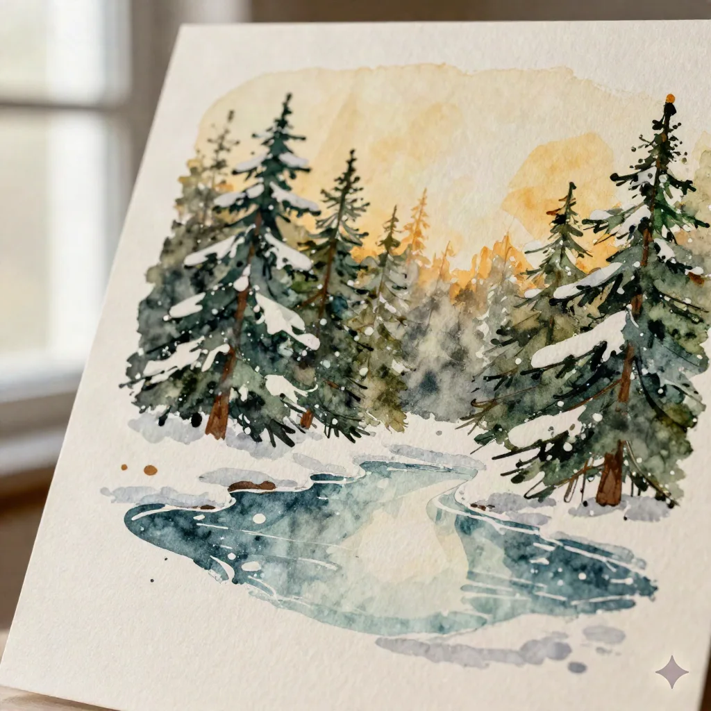
Watercolor: Ask for "loose watercolor wash," "visible brushstrokes," and "soft bleeding edges." Add "uneven paper texture" and "pooling in shadows" if you want the result to feel hand-painted rather than digitally filtered. Be cautious with dark areas -- watercolor AI tends to render shadows as muddy gray-green when it does not have specific palette guidance. Specify a warm shadow color ("raw umber pooling in shadows" vs. "dark gray shadow") and the difference is significant.
Oil pastel: This is the warmest-reading style and consistently the hardest to get right without palette constraints. "Chunky oil pastel strokes," "visible wax texture," and "muted holiday palette" help establish the medium. Color temperature matters more here than in any other style: "warm amber and deep forest green" produces a card that reads as mid-century Americana; "bright red and pine green" reads as commercial gift wrap. The palette language, not the subject, carries the aesthetic.
Vintage postcard: Prompt toward the 1930-1960 range explicitly. "Halftone dot texture," "slightly faded cream background," "flat color blocking with minimal shadow," and a note about border style all help establish era. The word "lithographic" consistently pushes models back toward the historical reference when they drift modern. Without it, the result tends to look like a contemporary designer's interpretation of vintage rather than the real thing.
Paper-cut: "Clean silhouette layers," "visible cut edges," "single directional light source," and a specific number of paper planes ("three foreground layers, two background layers") all reduce ambiguity. This style punishes vagueness more than any other. Under-specified paper-cut prompts produce something that looks like a flat vector illustration with a shadow filter. Over-specified ones produce results that look physically impossible. The working range is narrow and worth iterating on.
Why the palette definition changes the output more than anything else
Most prompt guides spend the most time on composition and subject. The palette gets a line or two. This is backwards.
The model does not know what "holiday colors" means as an aesthetic judgment. It knows that red and green appear together at high frequency in its training data around the word Christmas. That is a statistical association, not a design decision. Leaving the palette to those defaults produces a card that is recognizably festive and indistinguishable from every other card in the stack.
Naming specific hues and their relationships changes the output at a level that adjusting the composition does not. "Deep burgundy, aged pine green, and warm ivory with a single accent of antique gold" produces something categorically different from "Christmas colors." The former is a palette that a mid-century illustrator might have approved. The latter is a category label.
Add a negative palette constraint. "No bright red, no electric blue, no stark white highlights that blow out in print." Negative constraints reliably reduce the probability of the model's most common outputs. They cost nothing to add and consistently narrow the gap between what you asked for and what you get.
Prompt anatomy: the five elements that actually move the result
After working through dozens of iterations across the four main styles, these are the elements that produce meaningful change in output:
Style reference -- named, specific to an era or technique (not just "watercolor" but "loose mid-century watercolor wash")
Palette definition -- two or three named hues plus one negative constraint
Texture or substrate -- the implied paper type or printing process ("laid paper texture," "lithographic grain," "cold press watercolor stock")
Focal clarity -- what the card is actually about, stated simply ("a wreath with three candles," "a cardinal on a snow-covered branch", not "a festive winter holiday scene with elements")
Negative space instruction -- where the text will go, even if you are not adding text in this generation pass
You do not need all five in every prompt. Dropping two of them is workable. Dropping three or more is where the results start arriving at generic.
What happens when the AI does not have a photo to work from
Everything above applies to Christmas card art generated from scratch: decorative scenes, pattern work, wildlife illustration, wreath compositions. It works well when the card is primarily ornamental.
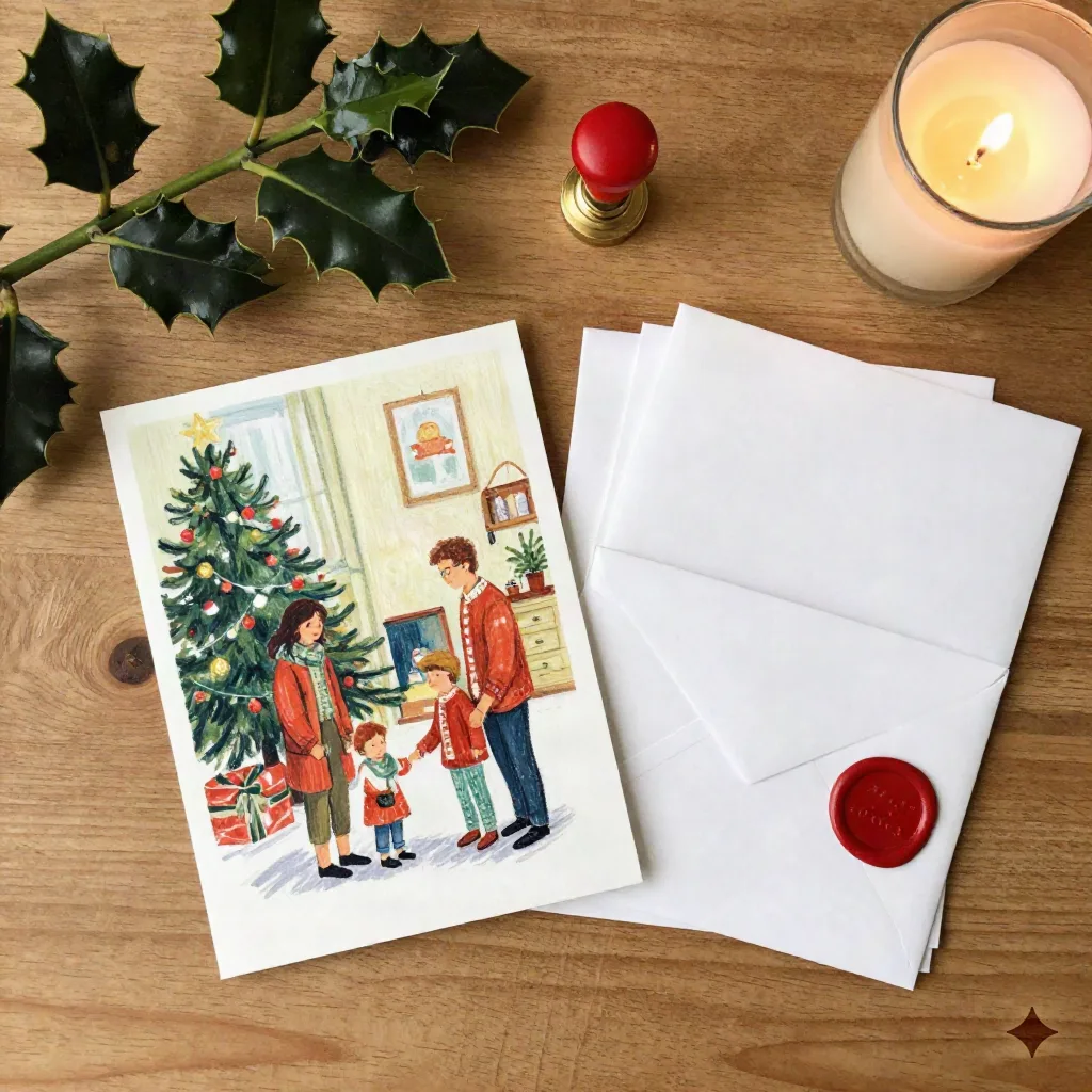
The harder problem is what most people actually want: a card that includes their family. A card where the portrait they took in October -- the one with reasonable light and the dog finally sitting still -- gets rendered in watercolor or oil pastel and arrives at the recipient's door looking like something that was illustrated for this specific family and no other.
Text prompts fail at this almost completely. A prompt cannot reproduce specific faces, the way your children stand together, the expression your partner makes when they think someone is about to take a photo. The model generates a plausible family in a plausible pose. It is consistent with your prompt. It has nothing to do with your actual life.
Photo-input models exist for this. They accept the image you have and render it into a painted style, rather than constructing a painted image from a text description. The output is your family, illustrated. The distinction matters, and it represents the ceiling that prompt engineering alone cannot clear for personal cards.
The screen-to-print gap that most prompt guides skip
There is a practical problem that almost no AI art prompt guide addresses, because most guides are written for screen output: AI-generated Christmas card art that looks good at monitor resolution frequently does not survive printing.
Screen output is optimized for contrast and saturation. Print on matte or textured stock at 300gsm penalizes oversaturation and loses fine shadow detail entirely. A watercolor result that reads as luminous on screen can print flat if the model has overworked the dark areas, added excessive layered gradients, or used near-white highlights that map to nothing on cream stock.
The styles that consistently survive the screen-to-print transition with the least adjustment are flat-color vintage postcard and paper-cut. They are also the styles where prompt engineering produces the most consistent results. That correlation is not coincidental. Both styles were designed for print historically, and models trained on historical printing tend to internalize the substrate constraints.
If you are printing at a consumer service, test a single copy at actual size on the actual stock before ordering a full run. Check it in both natural light and warm interior light. If it reads as considered and specific from arm's length, you are done. If it reads as generic holiday art at arm's length, go back to the palette and add a constraint before sending the file.
Before you finalize the file
One habit worth building into any AI-generated card workflow: print a single proof before committing to quantity. Not on copy paper. On the stock you plan to use, at the actual finished size, trimmed to final dimensions. Hold it at arm's length. Look at it in the light where it will eventually be read.
The best AI art prompts for Christmas cards all have one thing in common: they describe a specific object with specific constraints, not a general aesthetic mood. A prompt that says "antique ivory background, loose watercolor wash, cold press paper texture, single cardinal on bare winter branch, warm amber and forest green palette, no text" will produce something with a point of view. A prompt that says "cozy Christmas watercolor" will produce something competent and forgettable.
The model trained on forty thousand cards from the 1940s through the 1970s already knows what holds up in a mailbox. Good prompts get you closer to that knowledge by being specific about what they are asking for. Generic prompts leave the defaults in charge, and the defaults have never been to anyone's particular address.